Viking Festival Sussex Inlet
A cluttered festival website rebuilt around clarity — audited, restructured, rebranded, and extended into an on-site check-in kiosk.
The festival’s website buried its most vital information. I rebuilt it around clarity.
The Viking Festival Sussex Inlet is a community celebration of Scandinavian heritage on the NSW South Coast, but its website scattered the things visitors most needed, tickets, parking, program, map, across inconsistent pages and PDFs. I redesigned it as a structured, accessible experience: a page-by-page audit translated into a clear information hierarchy, a documented Viking-inspired design system, and a consistent navigation model, then carried the same system into an on-site check-in kiosk.
I audited the live site page by page, and the problems were structural, not cosmetic.
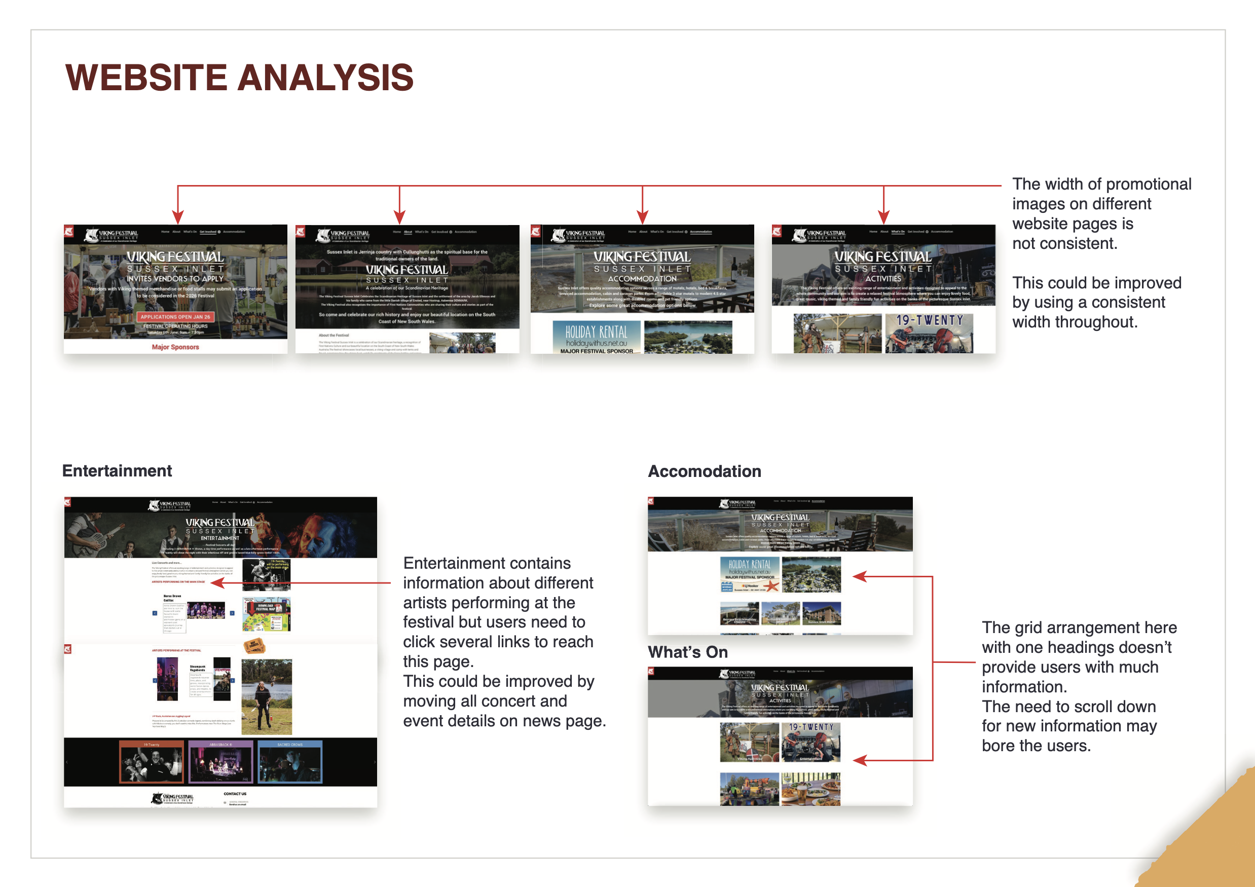
Before designing anything, I ran a heuristic audit of the existing website. The failures clustered into a few clear patterns.
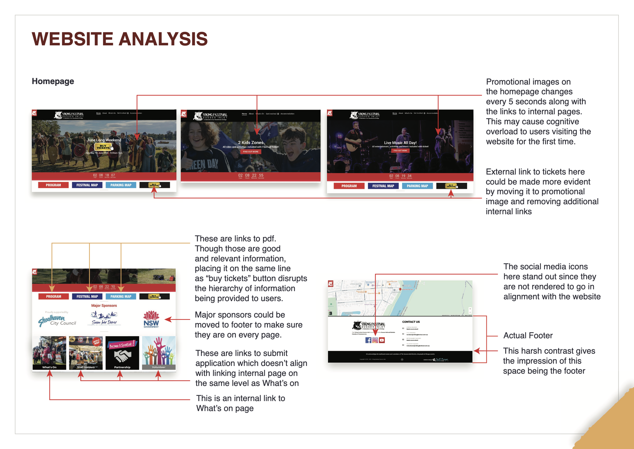
Vital info was hard to find
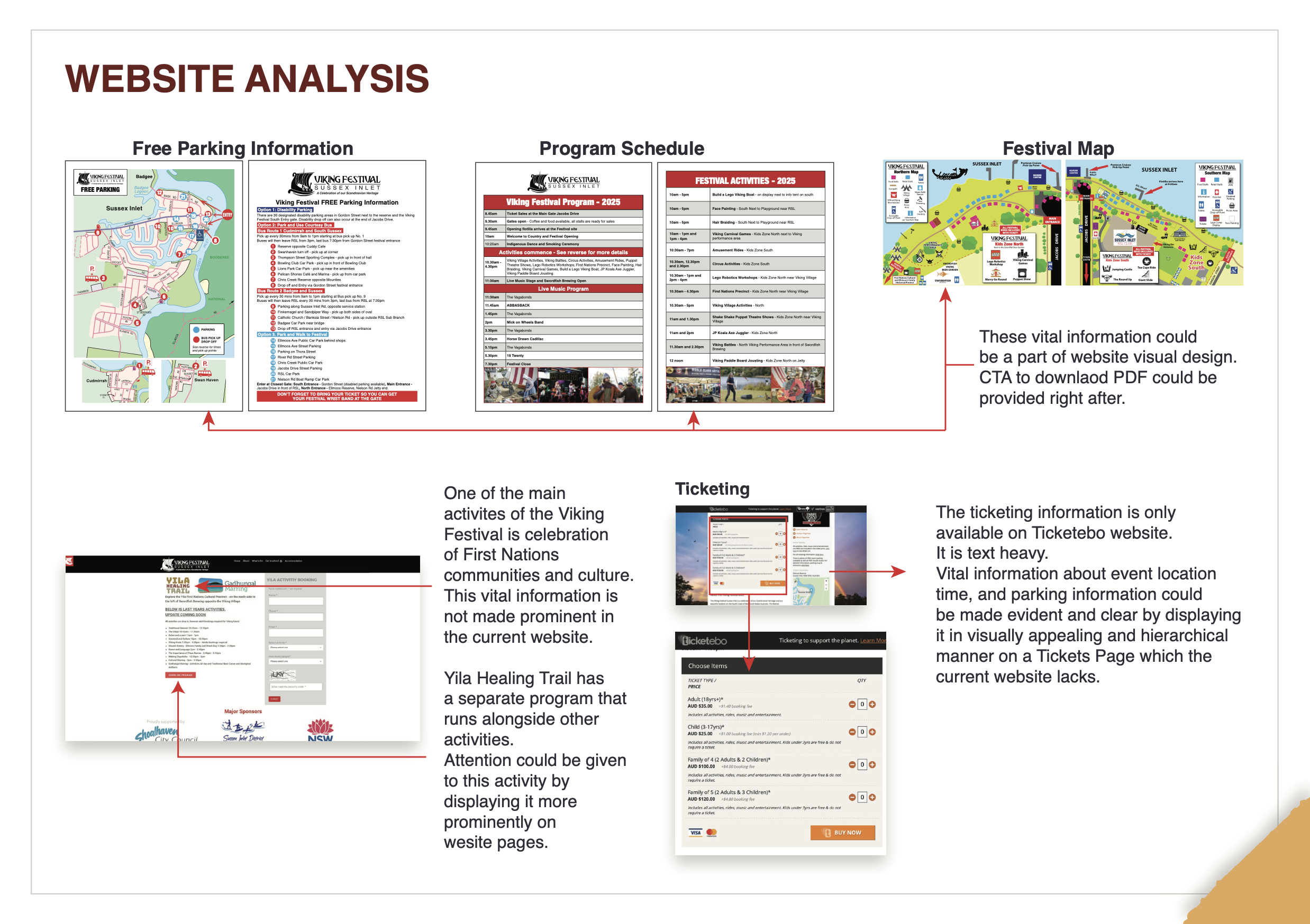
Parking, program, and the festival map lived in downloadable PDFs rather than on the page; ticketing was offloaded entirely to an external, text-heavy third-party site, hiding event location, time, and parking behind another click.
Inconsistent visual system
Promotional image widths changed page to page, and the homepage carousel swapped images and internal links every five seconds, risking cognitive overload for first-time visitors.
Broken hierarchy
PDF links sat on the same line as the “Buy Tickets” button, flattening the hierarchy; internal and external links were visually indistinguishable; and a harsh colour break made a mid-page section read as the footer.
Buried content
Key content like the First Nations Yila Healing Trail, a significant part of the festival, took several clicks to reach and wasn’t given prominence.
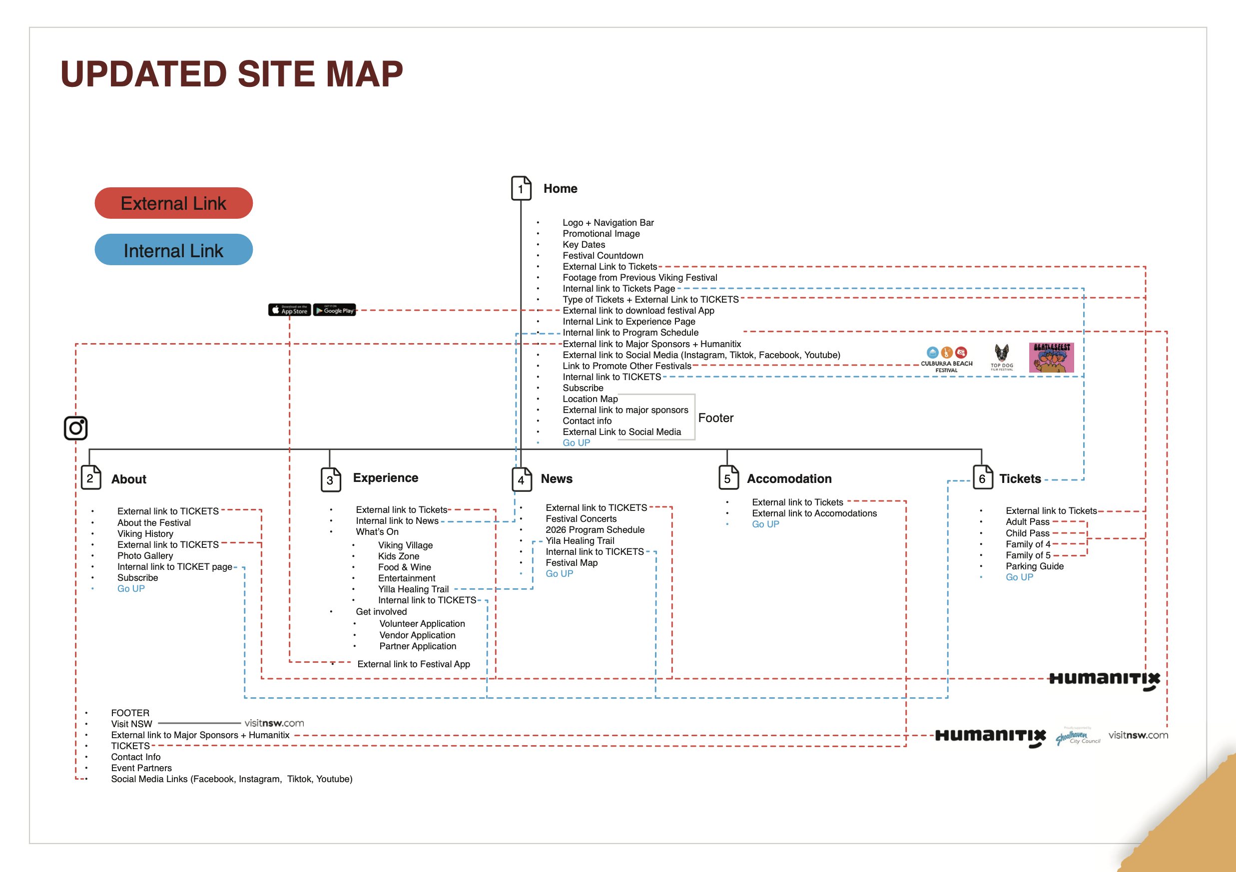
So I rebuilt the information architecture: six clear pages, with internal and external links finally distinct.
I restructured the site into a clear six-page architecture, Home, About, Experience, News, Accommodation, and a dedicated Tickets page, and mapped every link, colour-coding internal versus external destinations so users always know where a click will take them. Information that had been trapped in PDFs was brought onto the pages themselves, with downloads offered as a secondary option rather than the only route. The buried Yila Healing Trail was given its own prominent placement.
Then I built a documented design system, so the festival finally looked like itself.
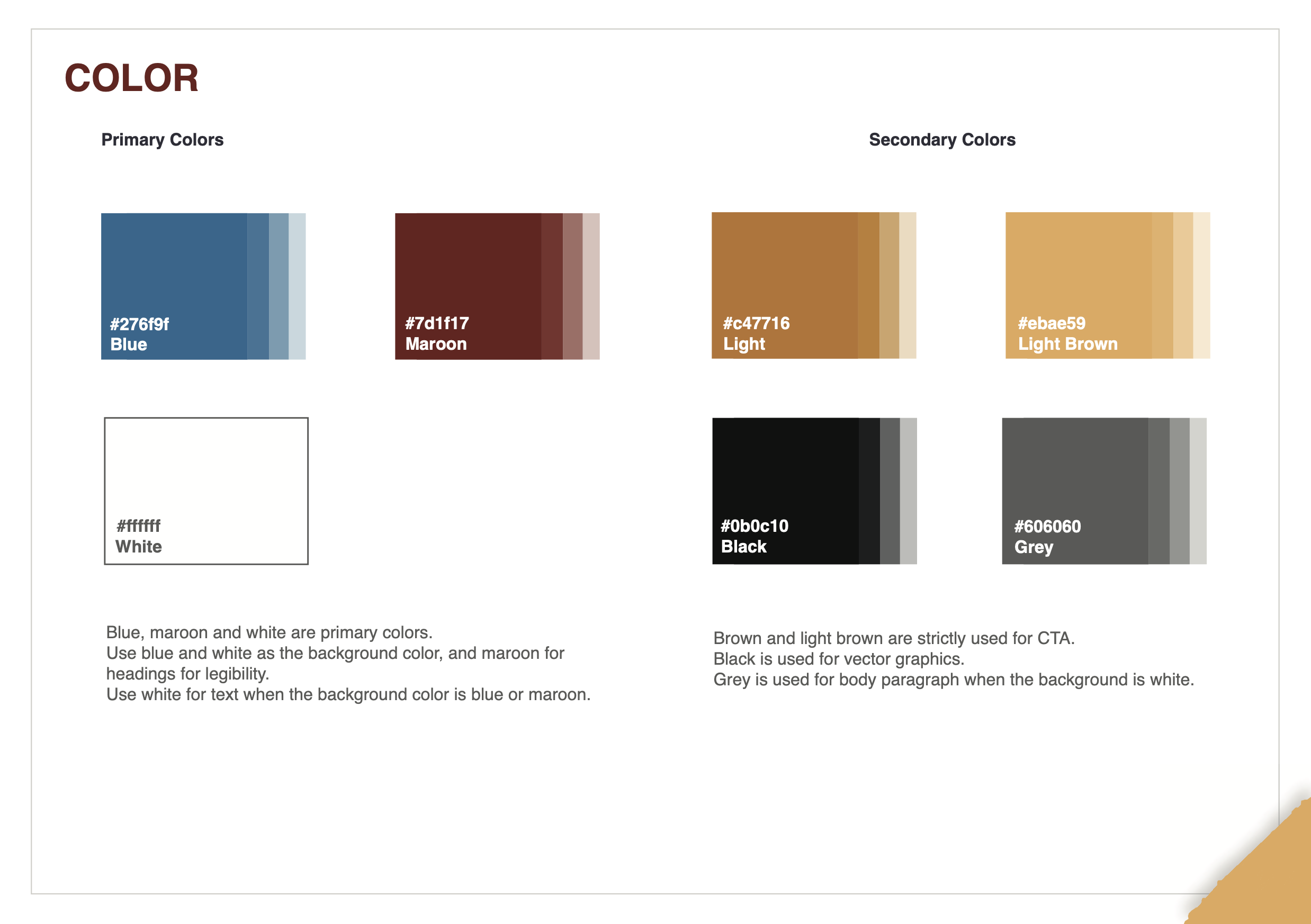
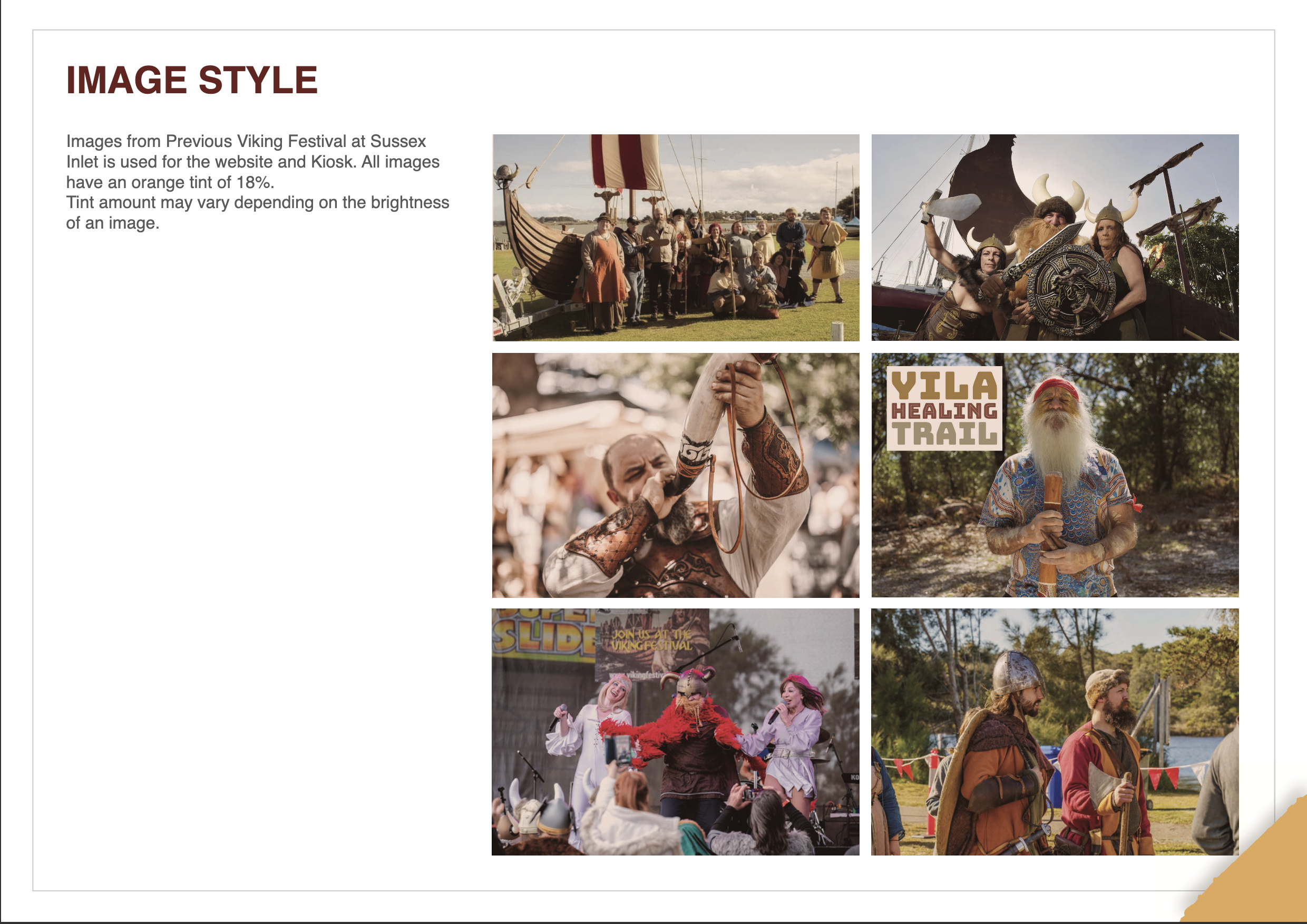
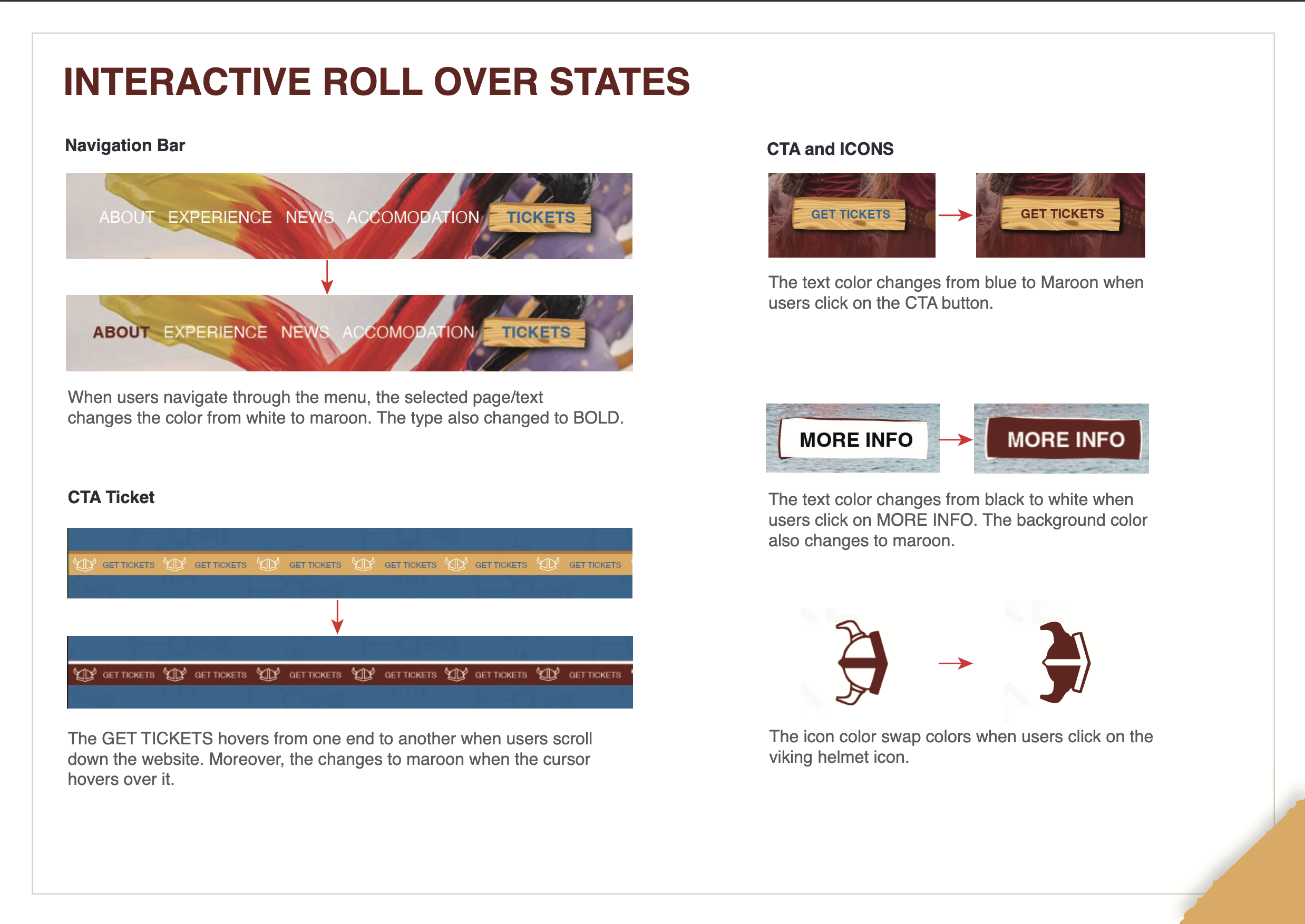
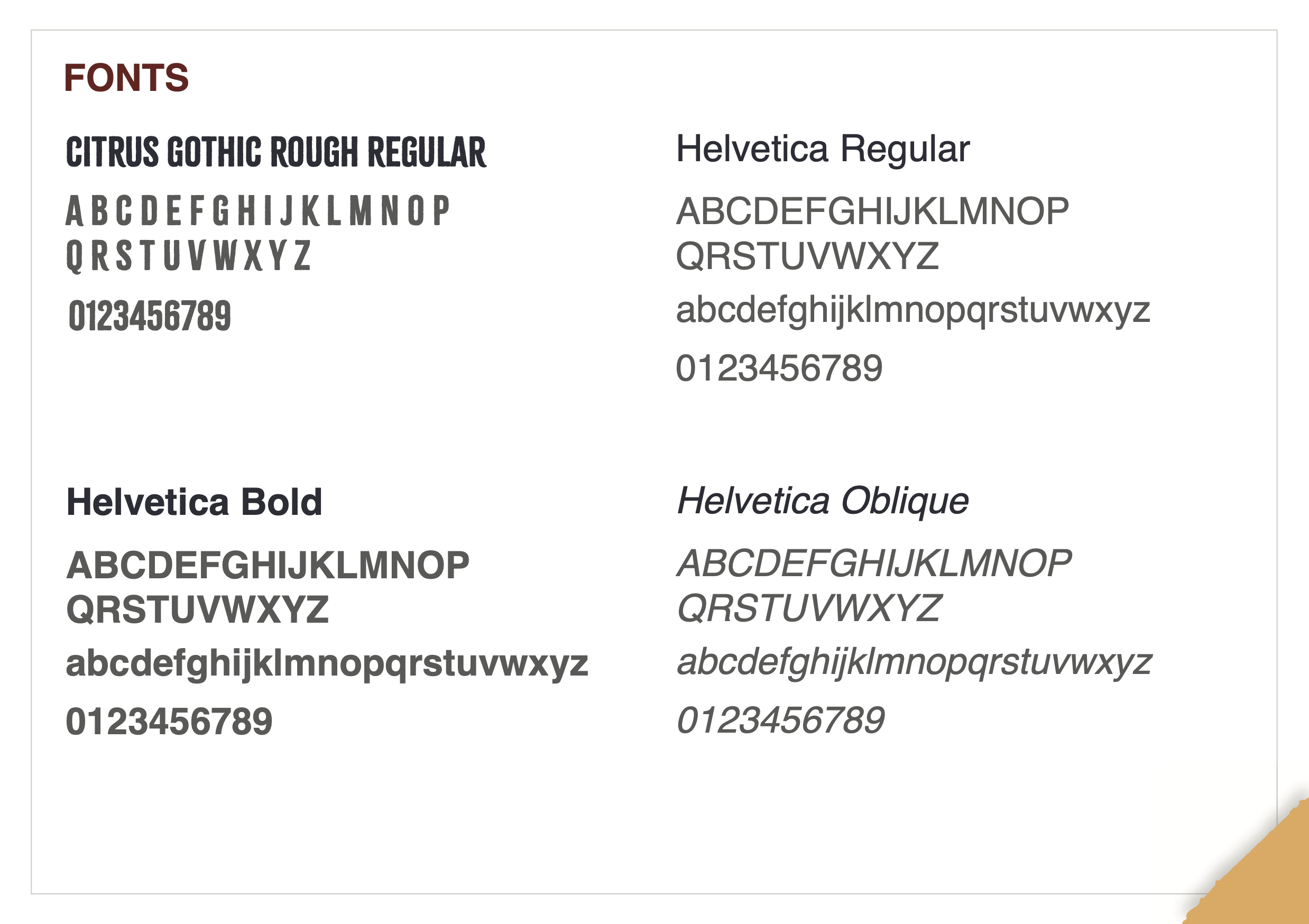
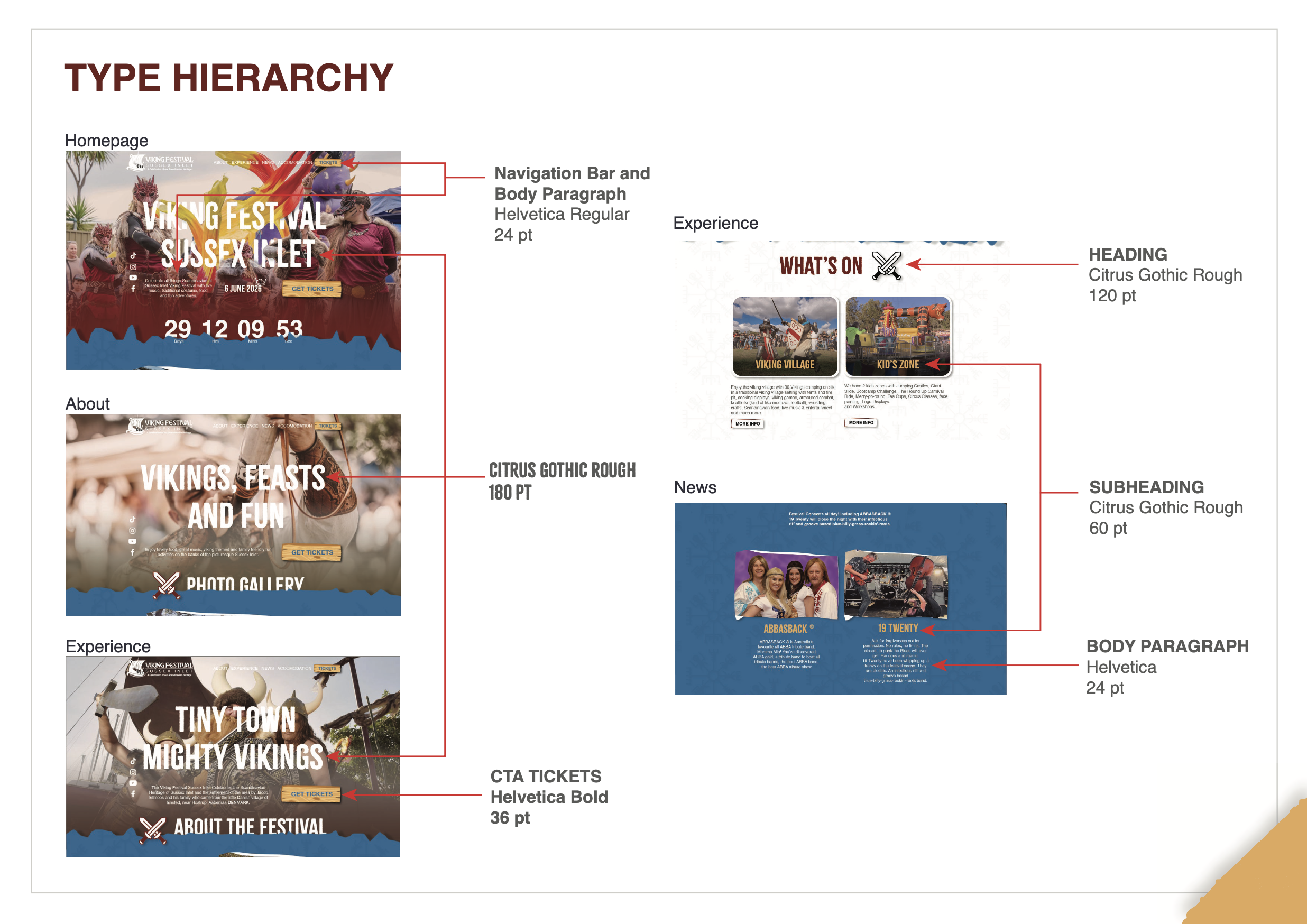
The redesign runs on a documented system, not one-off decisions. A primary palette of blue, maroon, and white (with brown, black, and grey as secondary roles) keeps text legible and CTAs consistent. Type pairs Citrus Gothic Rough for characterful Viking headings with Helvetica for readable body copy at a defined hierarchy. Nordic patterns, sword-motif headings, and wooden CTA buttons give it a cohesive festival identity, and interactive roll-over states for navigation, CTAs, and icons are specified so the build behaves predictably. The point of documenting it was reuse: the same tokens then carried, unchanged, into the kiosk.
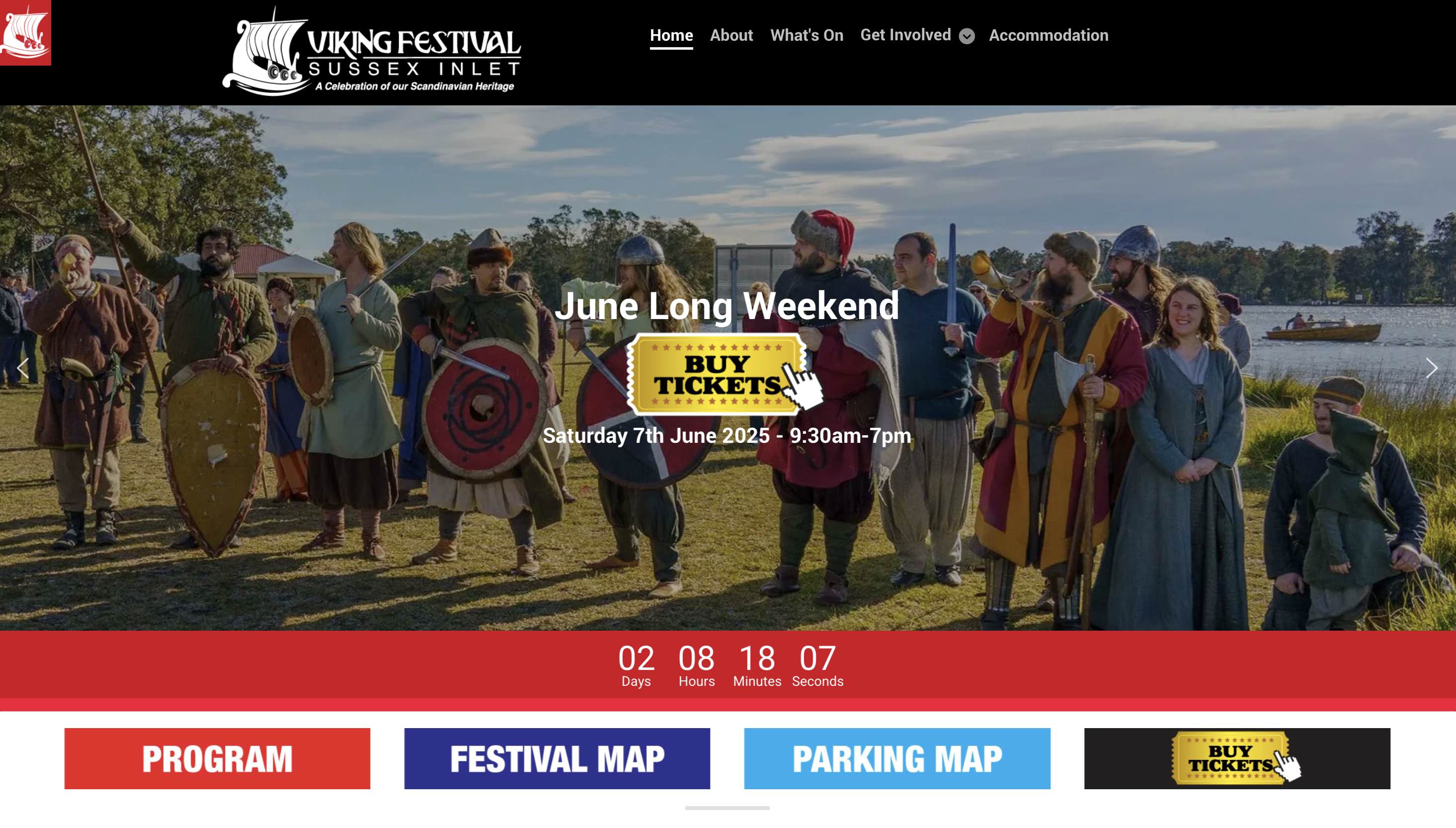
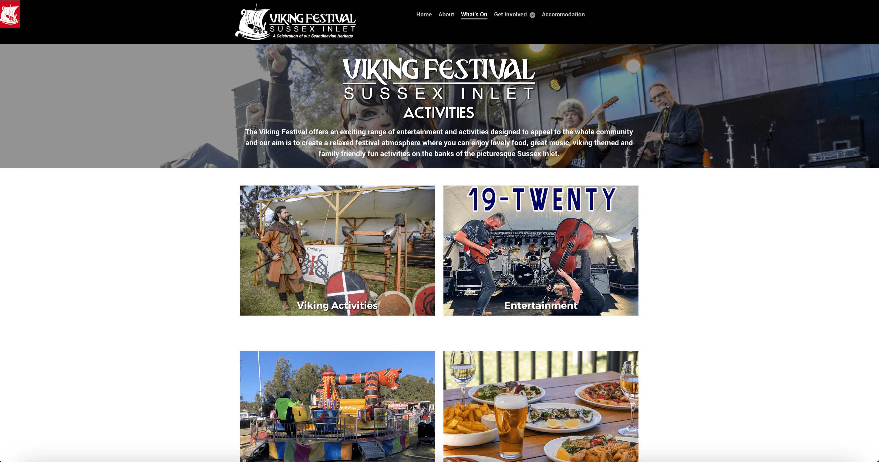
The redesign puts the vital things one glance away.
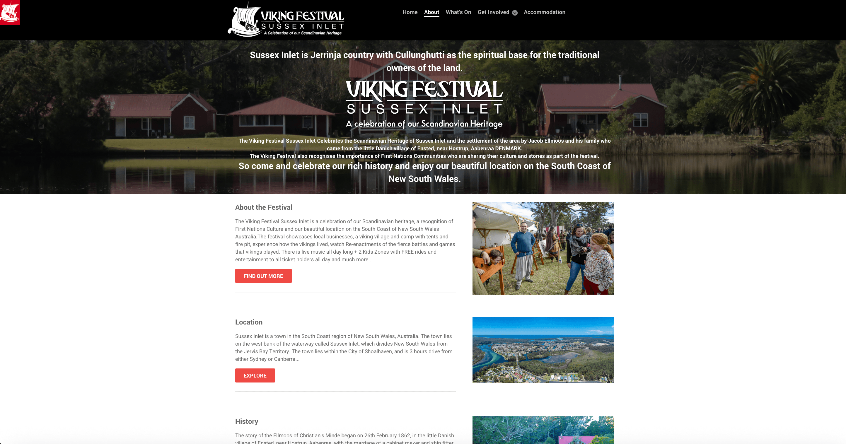
Placed beside the live site, the redesign carries the same content, restructured so visitors find what they need without hunting. This is a concept redesign, shown against the current live site for comparison.

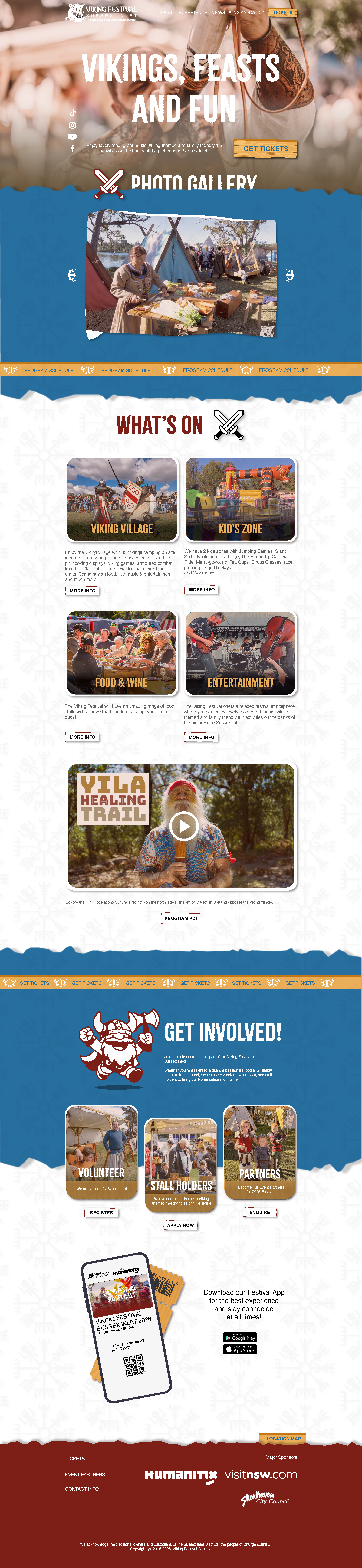
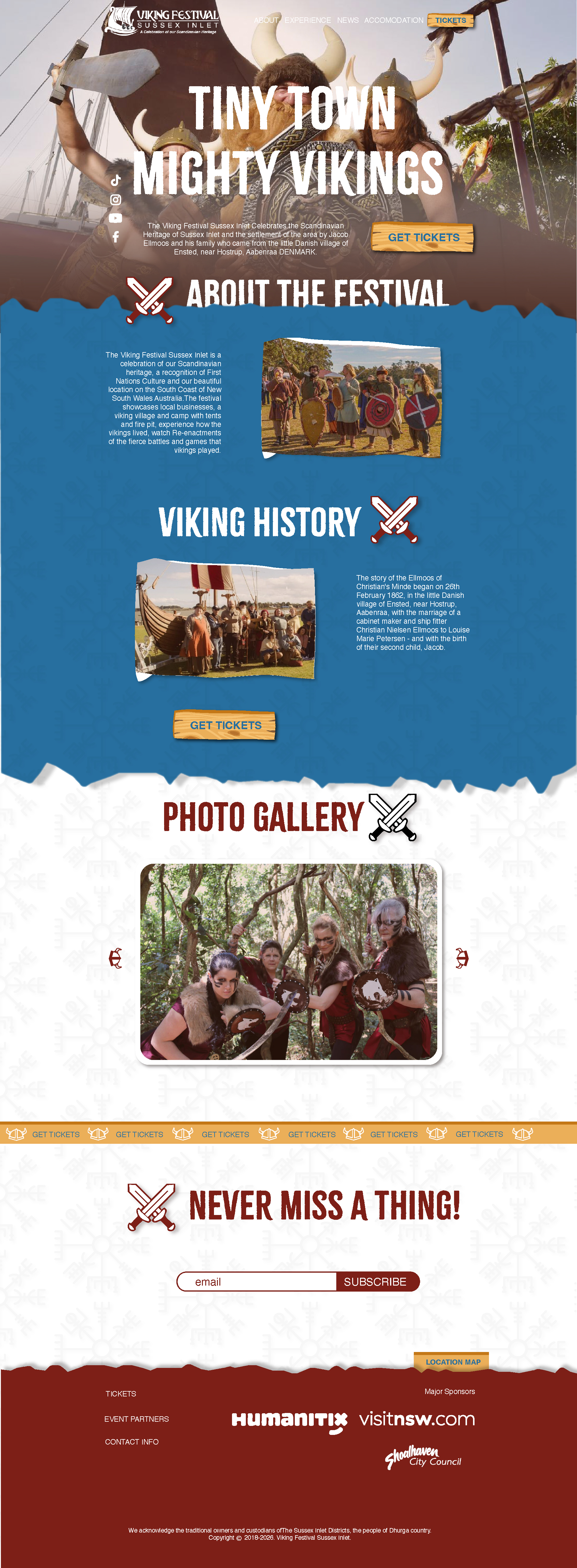
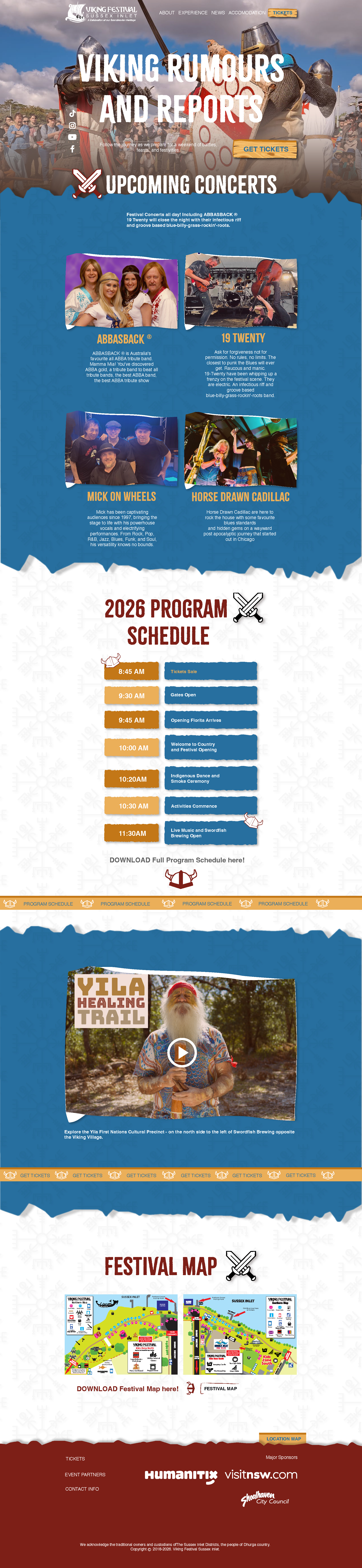
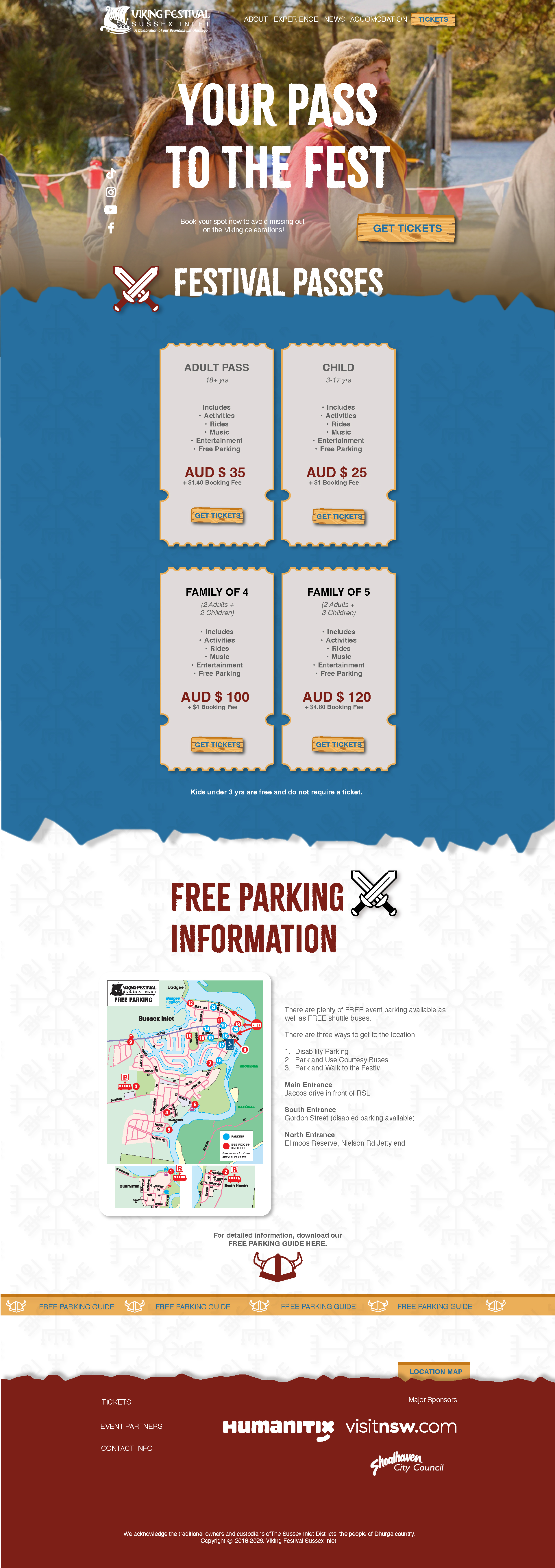
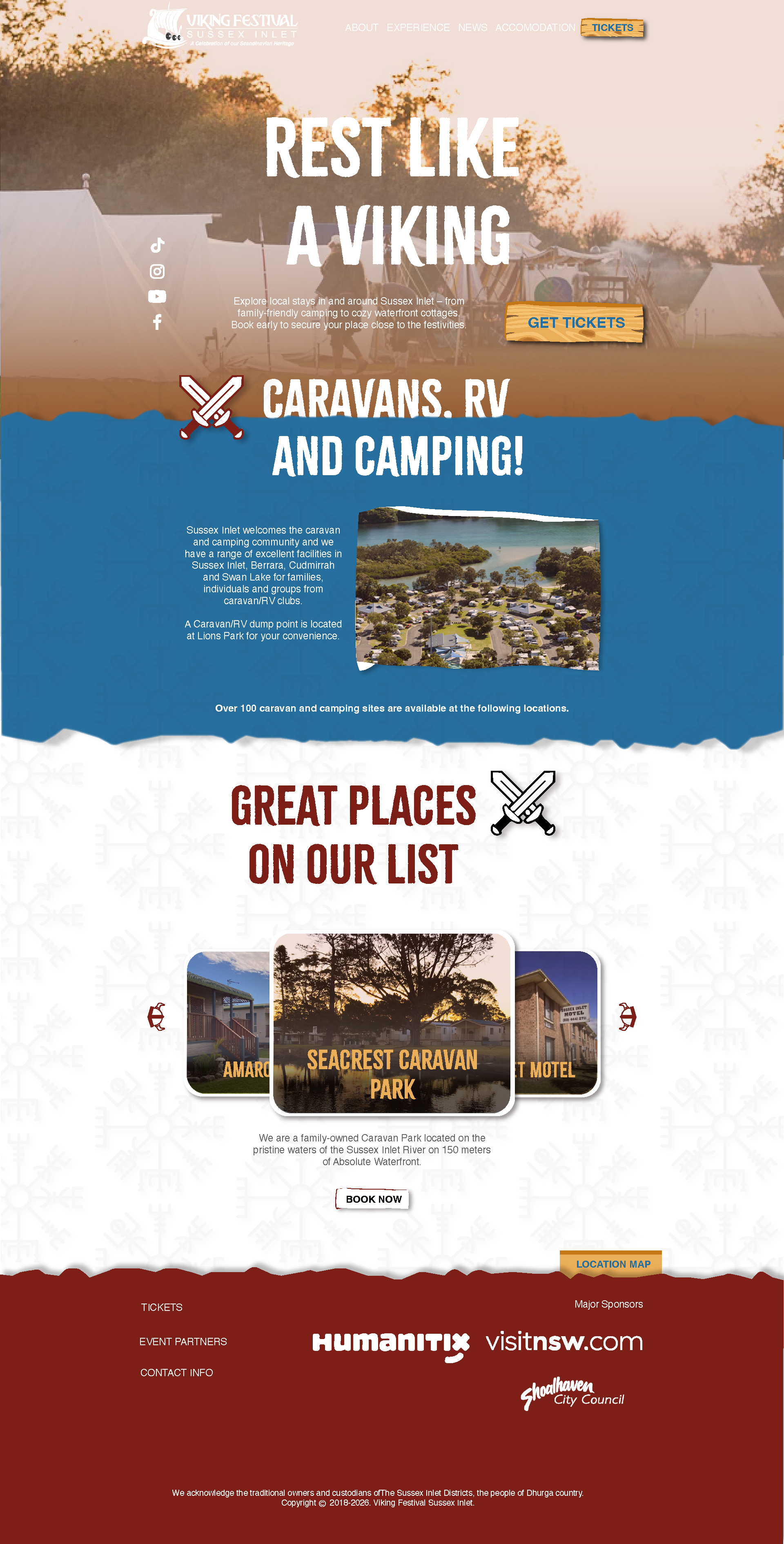
Redesigned pages of remaining three pages.
I extended the system to an on-site kiosk, and this is the part I put in front of users.
To show the system holds beyond the browser, I designed a physical festival check-in kiosk: the same palette, patterns, and motifs, a “touch the Viking swords to start” entry screen, and a QR-scan flow for collecting wristbands, with SMS and email fallbacks for anyone without a code.
I put an early version in front of about five classmates and iterated on their feedback. Two changes came directly out of it: I moved the QR-scan placement, and I rebalanced the visual hierarchy, because the primary action was reading as too small and insignificant to carry the screen. The feedback on the revised flow was that it was noticeably clearer to move through. I gathered design feedback and iterated on it rather than running a formal usability study, so this is an iteration loop, not a measured result, but it is the point in the project where a real reaction changed the design.
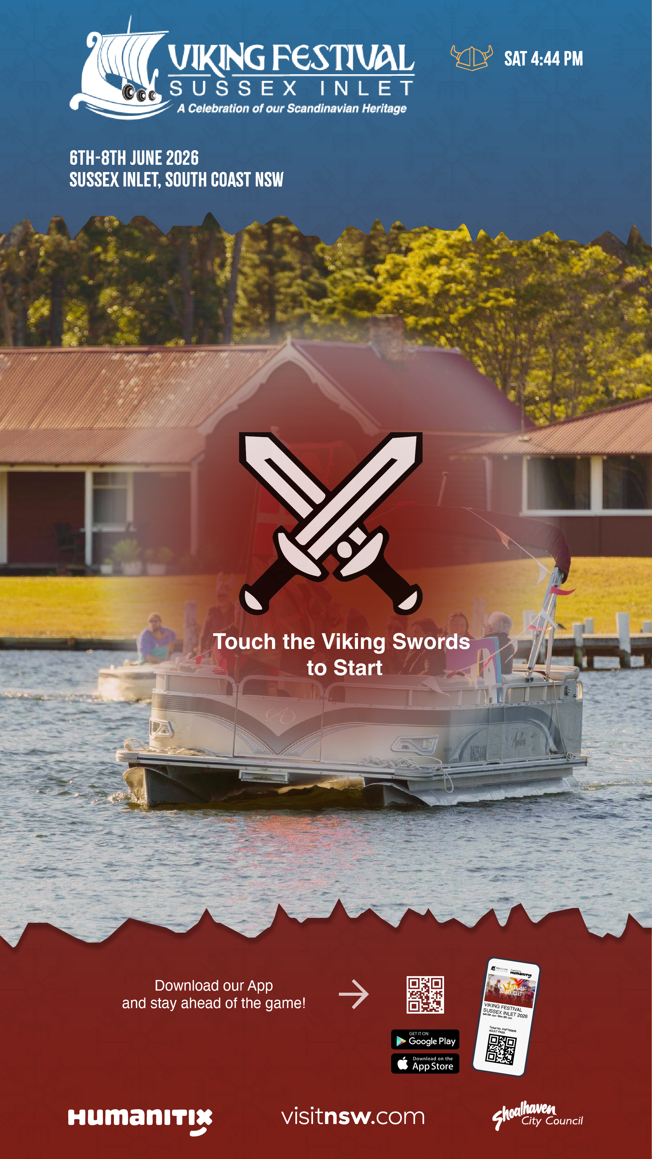
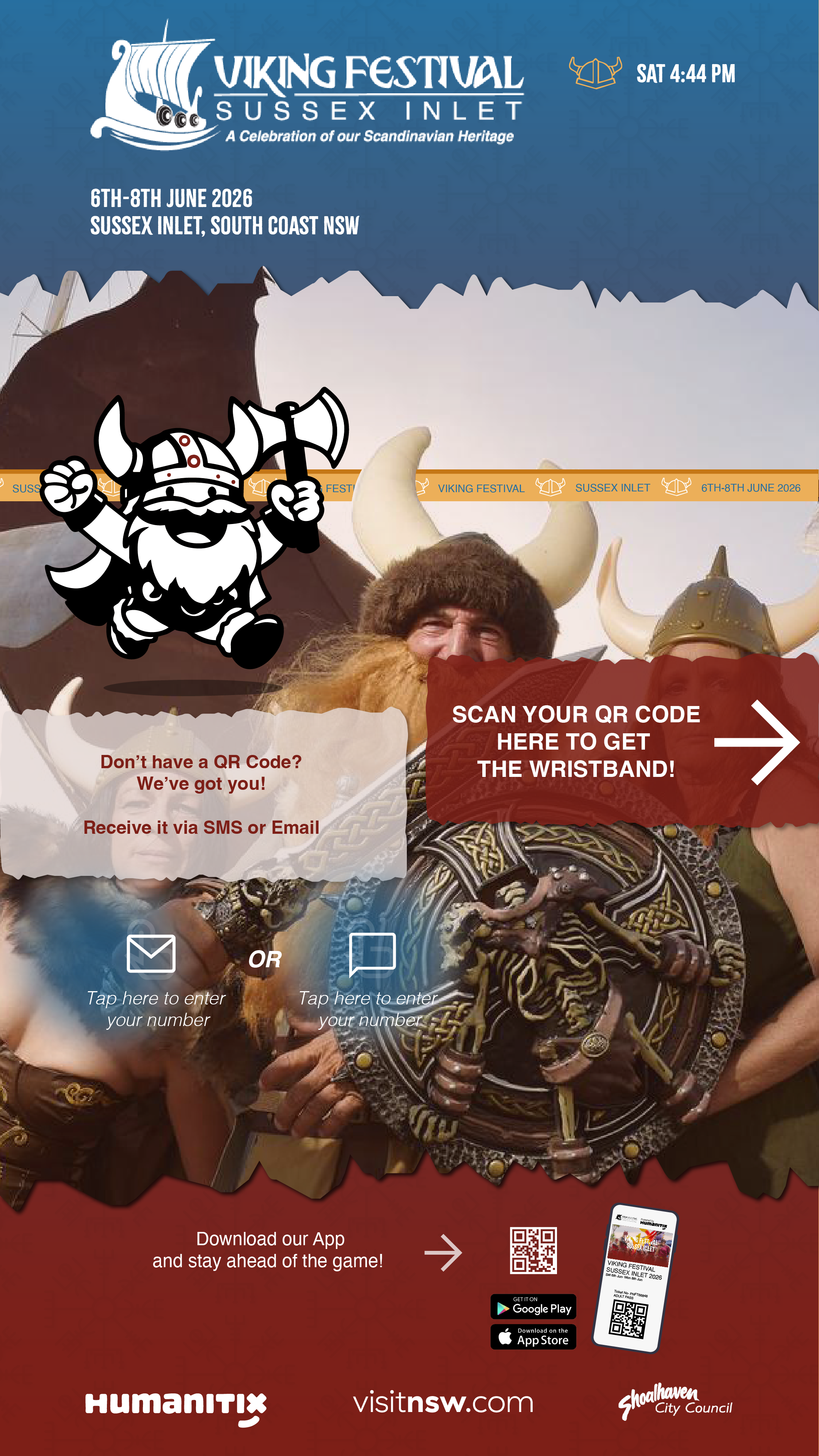
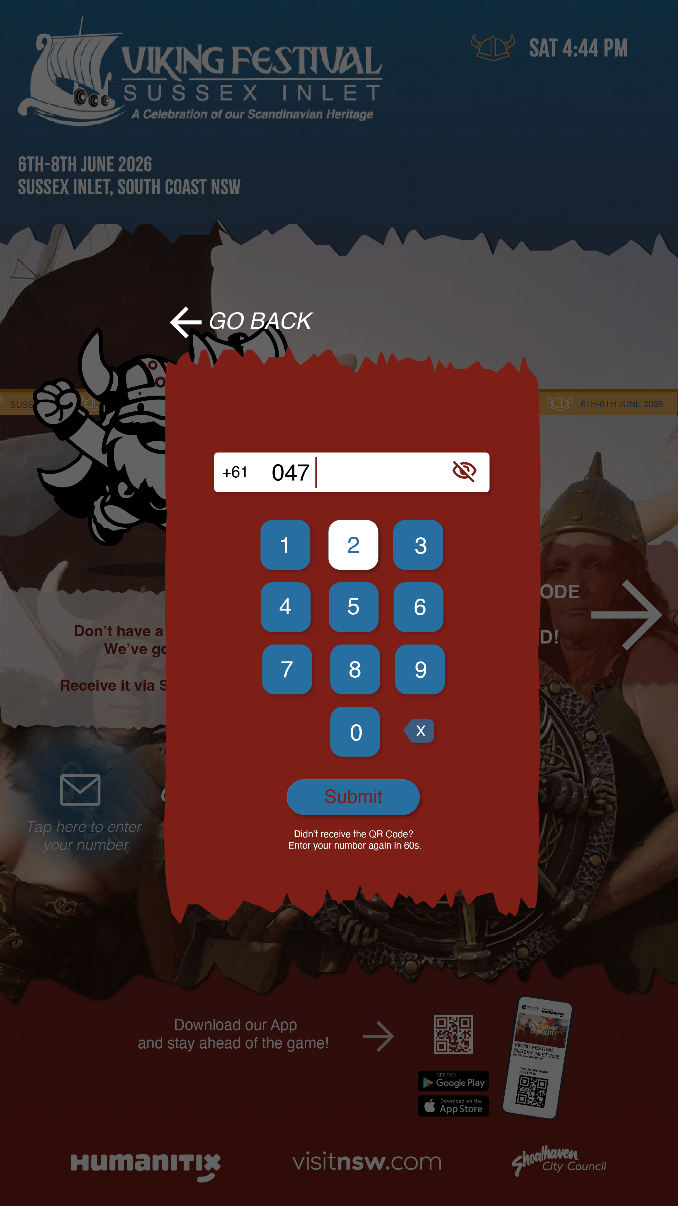
Building a documented system is what turned flat layouts into an interface that feels usable.
The lesson that reshaped how I work: consistency isn’t decoration. Instead of styling pages one at a time, I built a documented design system, palette, type hierarchy, pattern usage, and interaction states, and let it drive every screen and the kiosk alike. Early on, my first concepts had been critiqued as visually flat and unresolved, not yet carrying the mood of a people-oriented festival. Moving to a system-first approach is what turned that around: the next iteration landed the content, brand, and navigation far better, and the same tokens translated cleanly off-screen. A documented system is what makes a layout feel trustworthy and lets one identity hold across touchpoints.