Softy Safety
A GPS-enabled keyring that sends low-effort “I’m safe” updates to parents through light, instead of yet another text.
Two people trying to protect each other, and quietly making each other more anxious.
A student limits her messages so she won’t worry her parents. Her parents wait for those messages to feel safe. Both are acting out of love, and both end up more anxious. Softy Safety is a GPS-enabled keyring that closes that gap: it sends a real-time, low-effort “I’m safe” signal through light, so reassurance becomes something the student never has to remember to send.
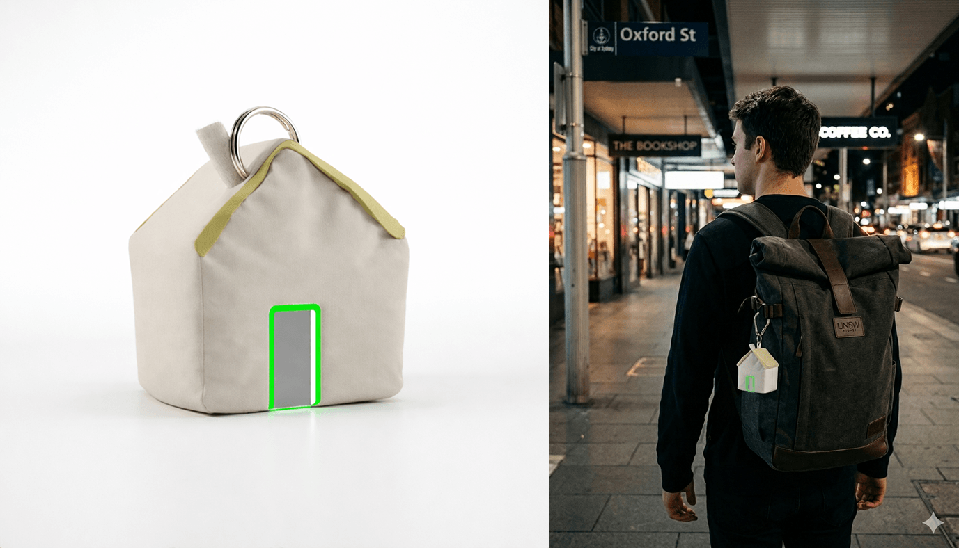
International students travel home late, forget to text, and everyone loses sleep.
UNSW international students often travel home late after evening classes on public transport. Between fatigue, delays, and dead phones, they forget or can’t always text when they get home. The parents are left anxious; the students are left feeling guilty. The two sides are pulling in opposite directions with the same intention: students try to reduce worry by communicating less, parents seek reassurance by hearing more.
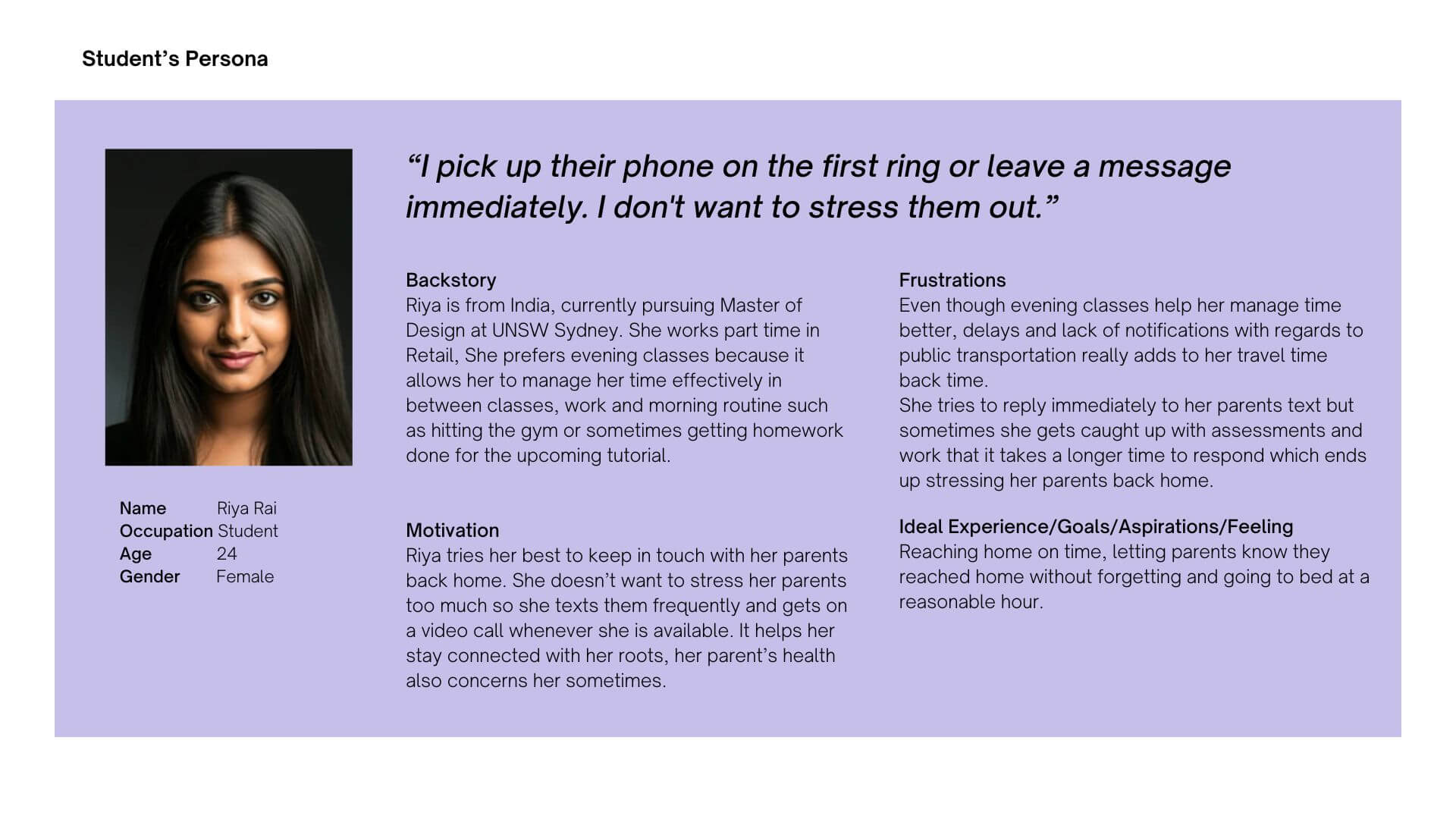
Students
Want to keep parents informed, but feel guilty when classes, work, or delays stop them responding in time. Fatigue and patchy connectivity make consistent updates hard in transit.
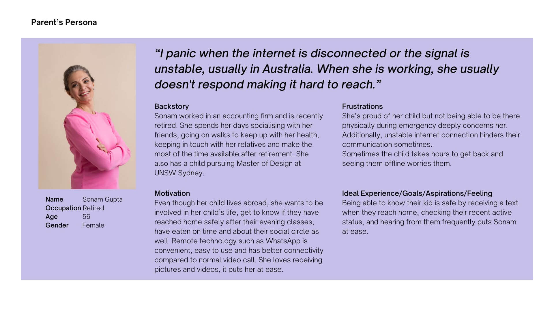
Parents
Rely on frequent updates as a signal of safety, and feel anxious when contact is delayed or absent. Distance deepens their dependence on small, consistent cues.
We talked to both sides, and I synthesised one tension neither had named.
We interviewed UNSW international students and their parents about their communication habits, emotional needs, and constraints of time, distance, and connectivity. I led the synthesis: affinity mapping surfaced the behavioural patterns across both groups and made one tension unmistakable, the pull between the reassurance parents want and the independence students want. A few insights shaped everything after:
- People prefer small, non-verbal cues, a light or a tap, over opening another app.
- Safety is emotional as much as practical: reassurance and connection matter, not just logistics.
- For many multilingual families, a wordless signal is less cognitively demanding than typing a message.
- Both sides ultimately want the same thing: simple, low-effort communication.
Those patterns resolved into two personas with one shared need, peace of mind without the effort: a parent who checks constantly and reads a delayed reply as risk, and a student who responds inconsistently and avoids over-communicating so as not to worry anyone.
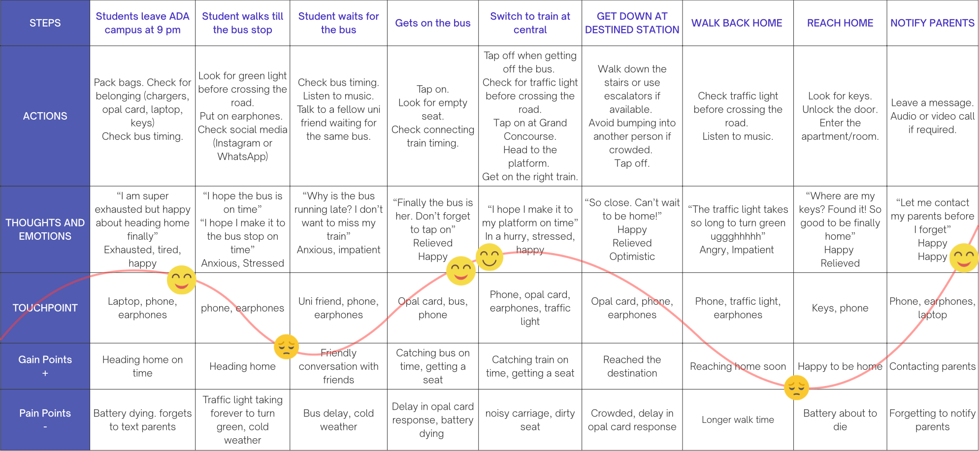
→ View the research & affinity map on MiroThe journey map changed the product: parents don’t want live tracking, they want one signal — she’s home.
I mapped the journey home and it reshaped the whole concept. The critical failure moments clustered during transit and right after arrival: a low battery, sheer exhaustion. But the deeper finding was about what parents actually wanted. They don’t want live telemetry following their child across the city. They want the one signal that matters, she’s home, delivered reliably, at the end. That single reframing moved the design away from tracking and toward a moment of arrival.
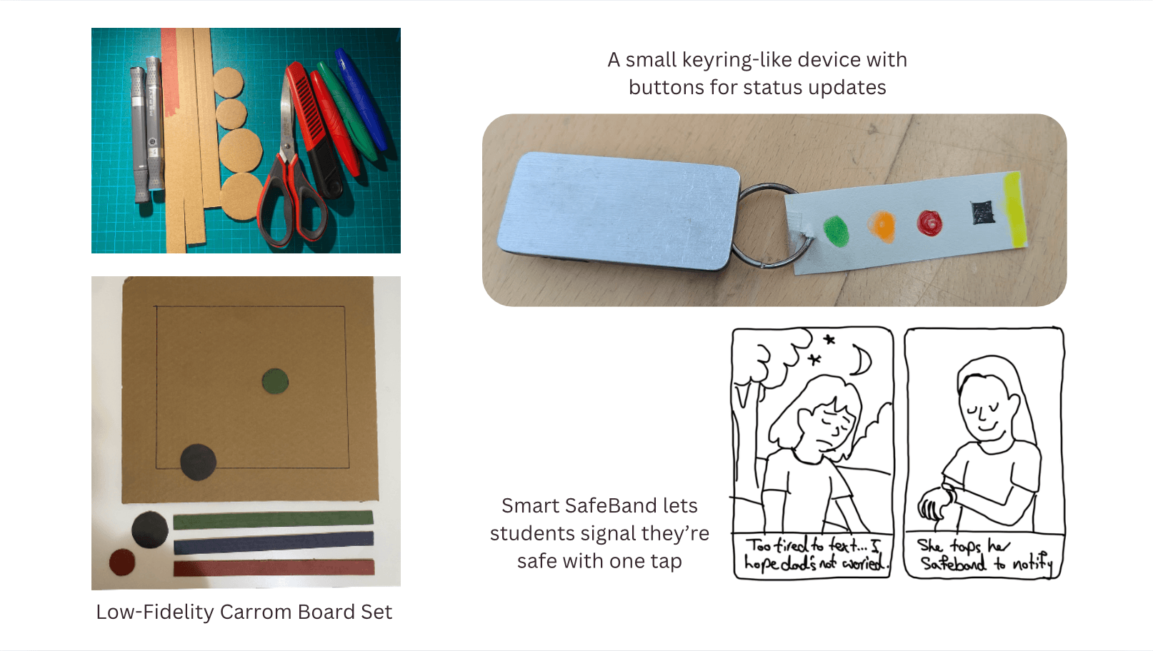
I started with a carrom board, then followed the friction to a keyring.
My first concept was a pair of connected carrom boards, one for parent and one for student, where movement and light said “I’m home” and “I miss you.” It was emotional and culturally grounded, but not portable, and it asked a parent to own a large object. From there we explored form factors, a handheld device and a wristband, mapping the trade-offs between emotional connection, ease of use, and portability, and converged on a house-shaped keyring.
- Always carried, because keys go everywhere the student goes.
- The house icon matches the “home = safe” mental model.
- Soft, character-like variants make it feel comforting and personal.
For the student
The keyring sits on their keys or bag and activates automatically via GPS when they leave campus. A light ring shows journey progress as they get closer to home. No app to open, no message to remember.
For the parent
A paired device at home shows the student’s progress. On arrival, it glows fully green with a gentle sound, and a toggle to silence it. An optional scent cue lets the student add a wordless “thinking of you.”
Every material taught us something the last one couldn’t.
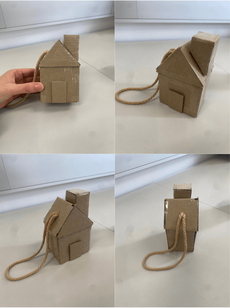
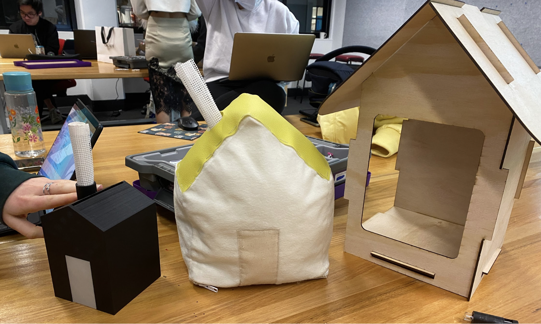
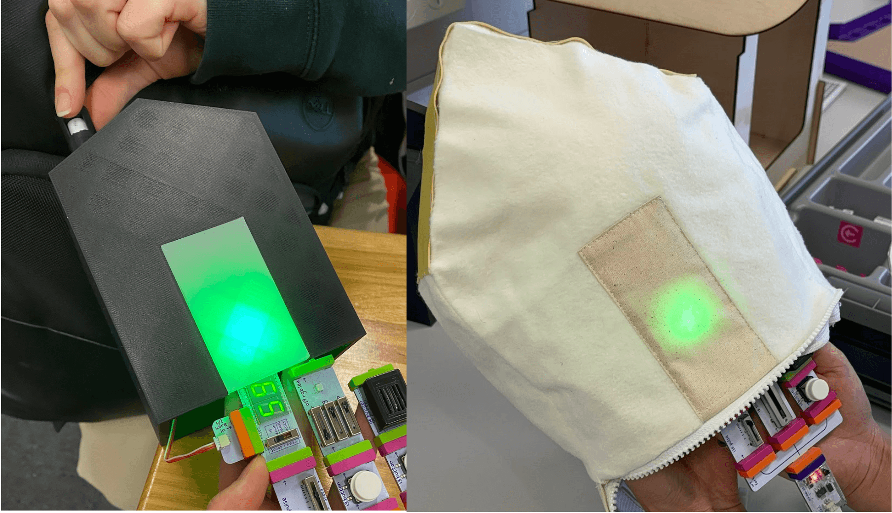
We built and tested across fidelities. A cardboard-and-LittleBits low-fi model tested size, the core interaction, and reminder-versus-automatic behaviour. What we heard: a reminder felt like extra mental load, so users wanted automatic activation, and the light and form needed work. We took that into three medium-fidelity houses.
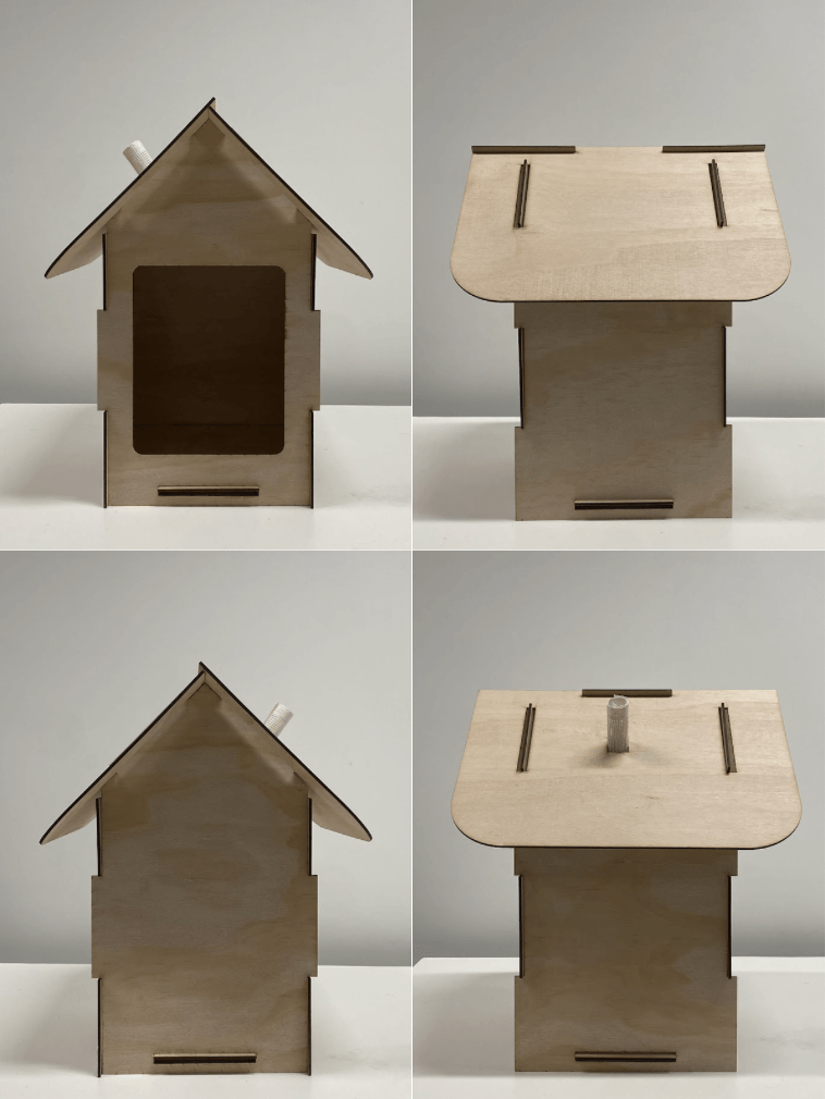
Laser-cut wooden house
Users liked the look, but it was too big and the light was hard to see.
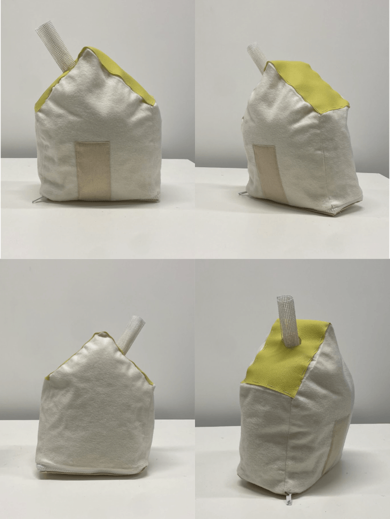
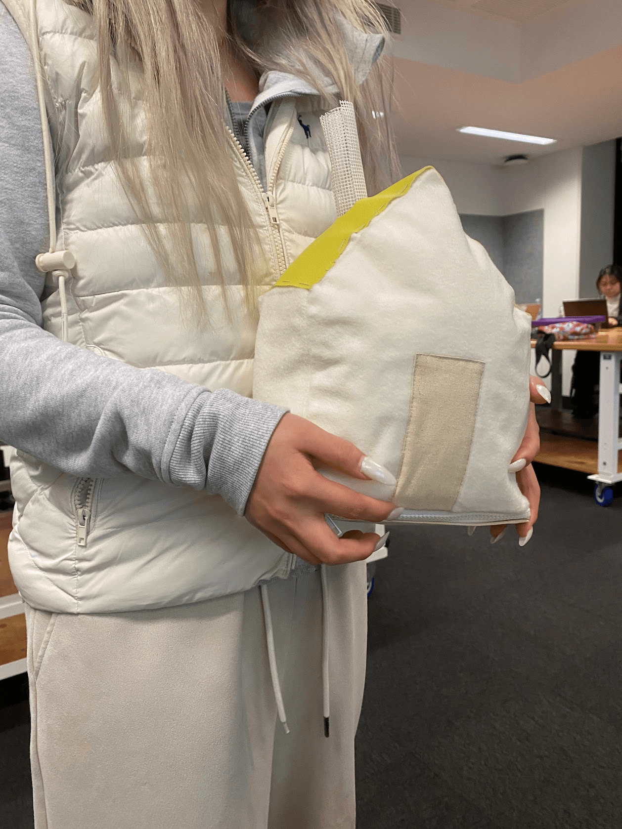
Textile house
Soft and comforting, described as cute and cuddly, but bulkier and less durable, with the light still hard to read.
3D-printed house
The winner on function: a much better size, tough, with a transparent door that made the light clear. Some wanted it slightly smaller and disliked the black.
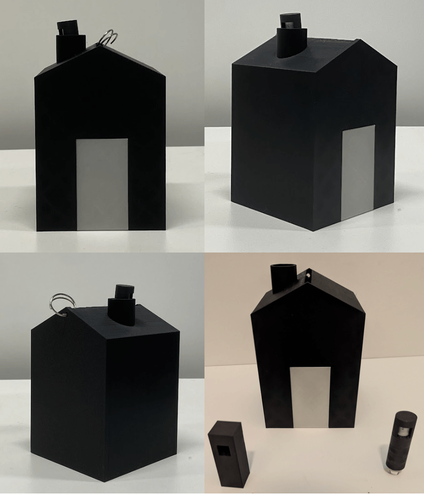
“It’s a much better size, tough.”
— User, 3D-printed prototype
“I like the look of it, but it’s quite large — I don’t know how practical that would be.”
— User, wooden prototype
A/B testing compared sizes and materials; semi-formal interviews after each session surfaced preferences on portability and comfort; and desirability studies asked the real question, which one would they actually carry or keep in their home. The prototypes settled the debates the interviews couldn’t: smallest practical size, 3D print for durability and clear light, a twist form that was easy to use, bright readable light, and a gentler alert than a buzz, because parents already get enough phone buzzes.
We turned every complaint into a design decision, then evaluated the result.
- Students forget to activate the device → automatic GPS activation.
- Size and portability concerns → a smaller, keyring-friendly form.
- Parents overwhelmed by buzzing → a sound toggle for parents.
- A wish for emotional reassurance → scent as an optional layer.
We evaluated the concept two ways. Against Google HEART, happiness came from ease of use and the 3D-printed size, engagement from the fabric’s comfort, and adoption from the strongly-liked automatic activation. A heuristic evaluation confirmed the fundamentals: status is visible through ETA lights (familiar from ride apps), the house-and-green-light matches the “home = safe” mental model, and automatic notifications prevent the error of forgetting.
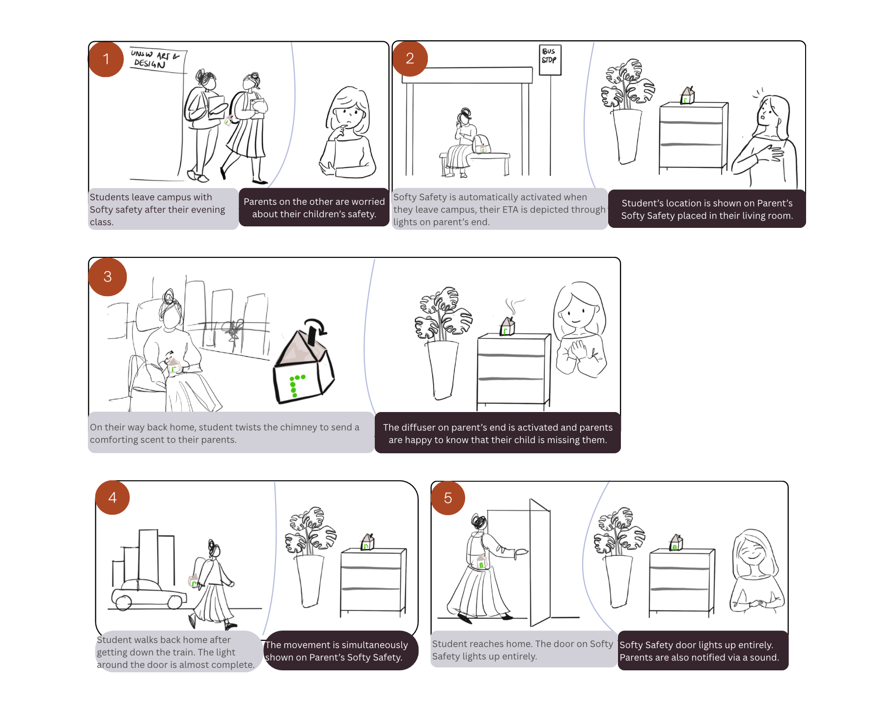
Storyboard
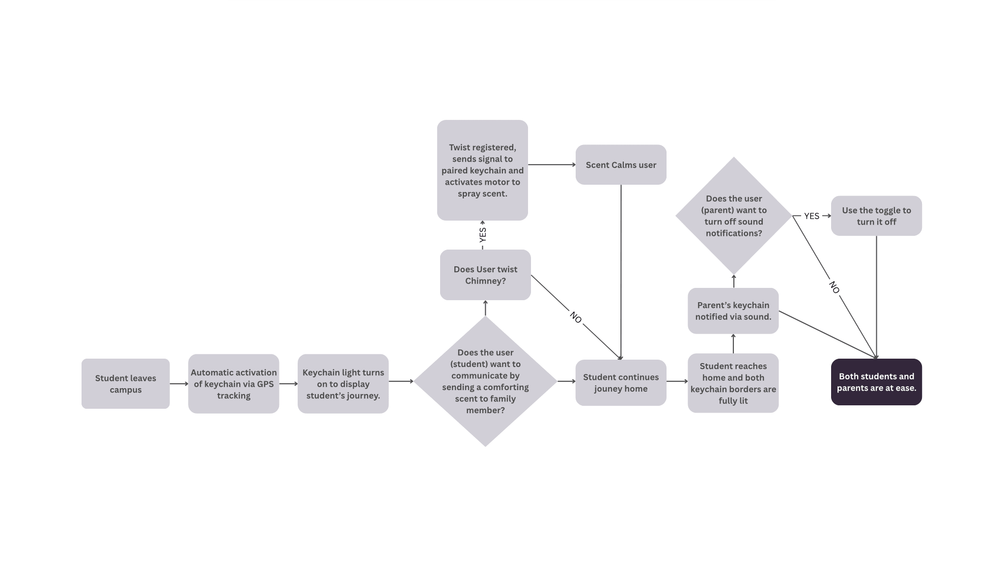
Data flow diagram
Before this ships, the ethics come first: consent, an off-switch, and protection from a controlling parent.
A device that tells a parent where their child is can be misused, and designing it responsibly means saying so out loud. Before anything like this shipped, I’d design the ethical safeguards first: informed consent, the student’s ability to disable it, and privacy protections that stop a controlling parent from turning reassurance into surveillance. Only then would I work with engineers to validate the hard constraints, GPS accuracy, battery life, waterproofing, and the scent mechanism.
The project itself taught me how to navigate two user groups with overlapping, sometimes conflicting needs, a student’s freedom against a parent’s need to know. I saw how a tangible artifact can address emotional safety rather than just functional tracking, and iterating across materials taught me the real trade-offs between comfort, durability, and visibility.