Maiti Nepal — Brand Identity Concept
A self-directed branding concept for a Nepali anti-trafficking NGO — an identity where every element carries meaning.
This is a self-initiated academic branding concept created as part of my Master of Design. Maiti Nepal is a real organisation with its own existing identity; this project is an independent design exploration and was not commissioned by or affiliated with them.
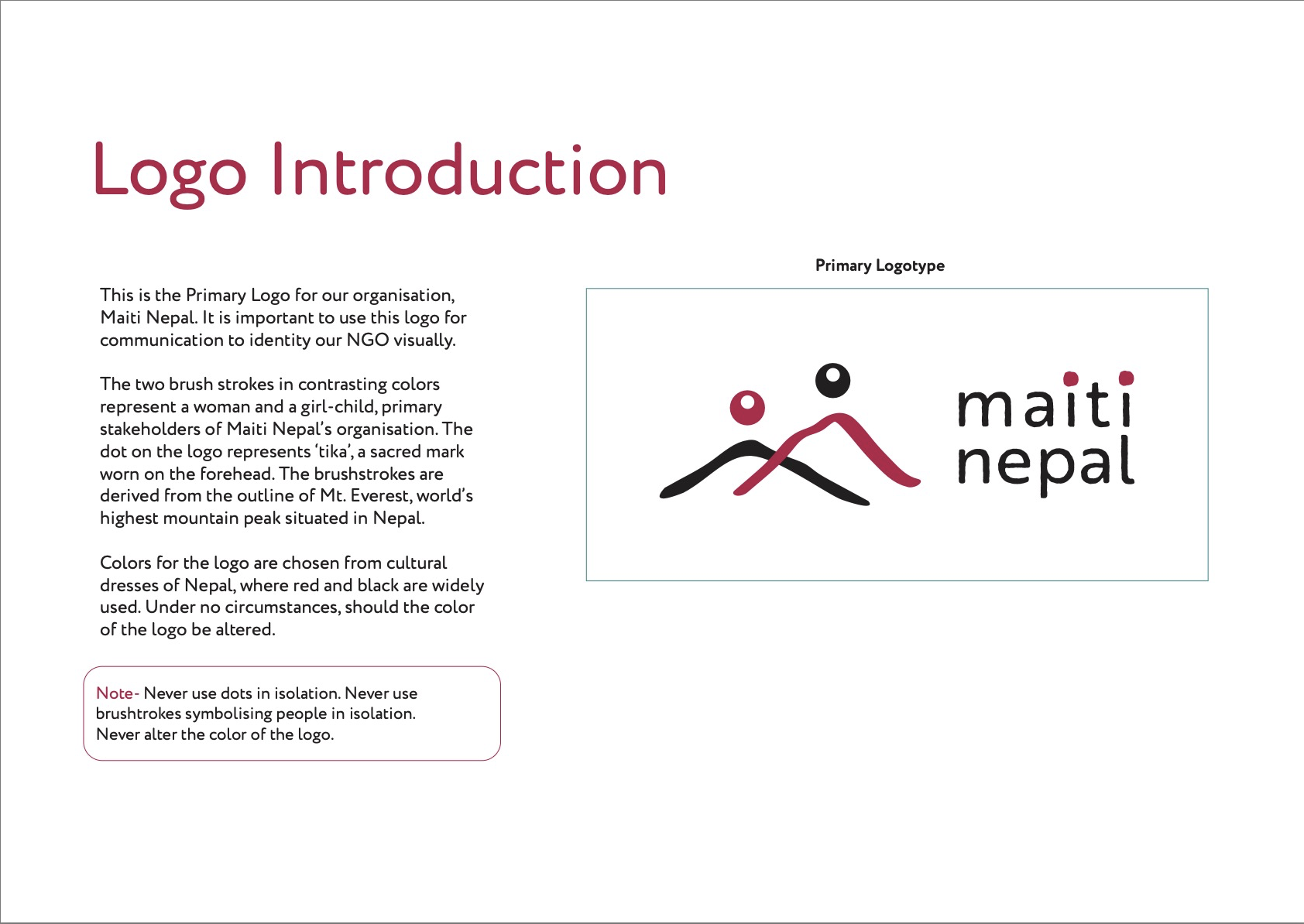
A logo for Maiti Nepal, where a mountain is also a mother and child.
Maiti Nepal is a Nepali NGO founded in 1993 by Anuradha Koirala that provides a home and a path forward for women and children who have survived trafficking, exploitation, and abuse. “Maiti” means a woman’s childhood home, a place of safety. For this self-directed concept, I designed an identity built entirely on meaning: a mark where every element says something about who the organisation protects and where it stands.
Every element earns its place.
The mark reads on several levels at once.
The two brushstrokes
Two contrasting strokes represent a woman and a girl-child, the organisation’s primary stakeholders. Their form is derived from the outline of Mt Everest, grounding the identity in Nepal itself.
The dot
The dot represents the tika, the sacred mark worn on the forehead, a small, culturally specific detail that roots the mark in Nepali life.
The colours
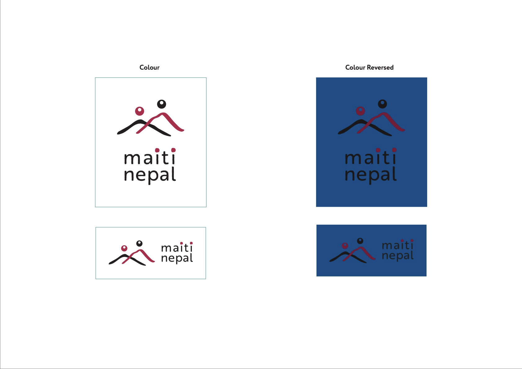
Red and black are drawn from traditional Nepali cultural dress, so the palette carries cultural meaning rather than being chosen for style alone.
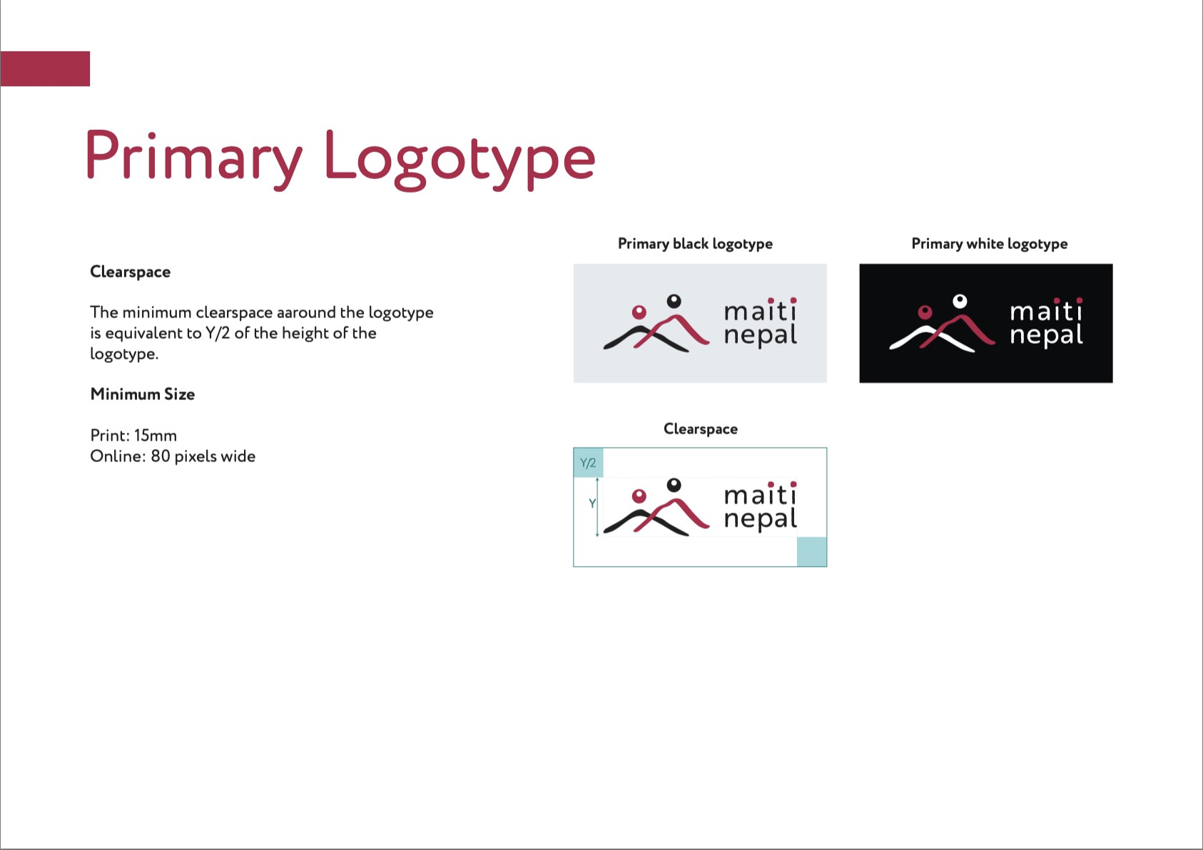
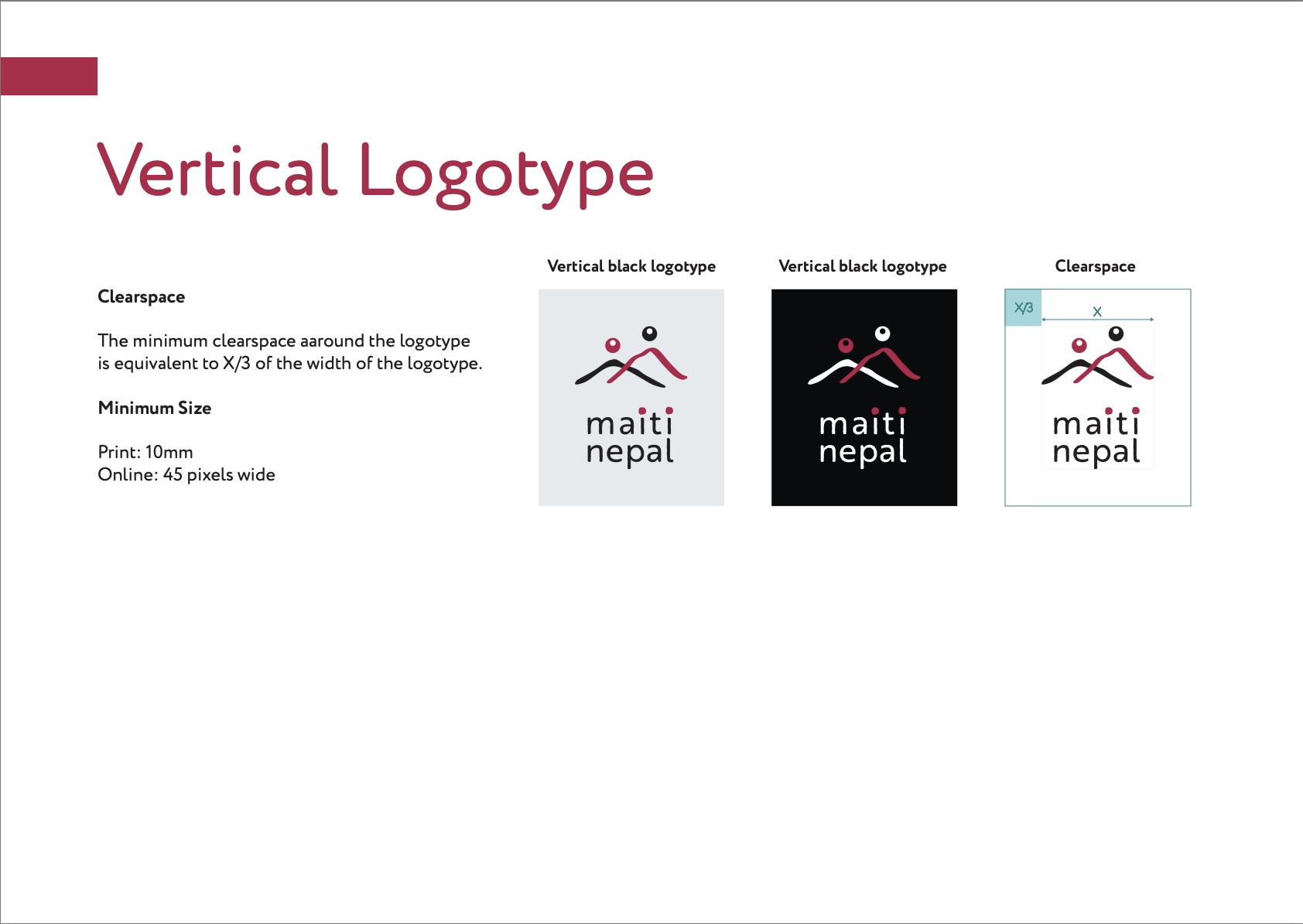
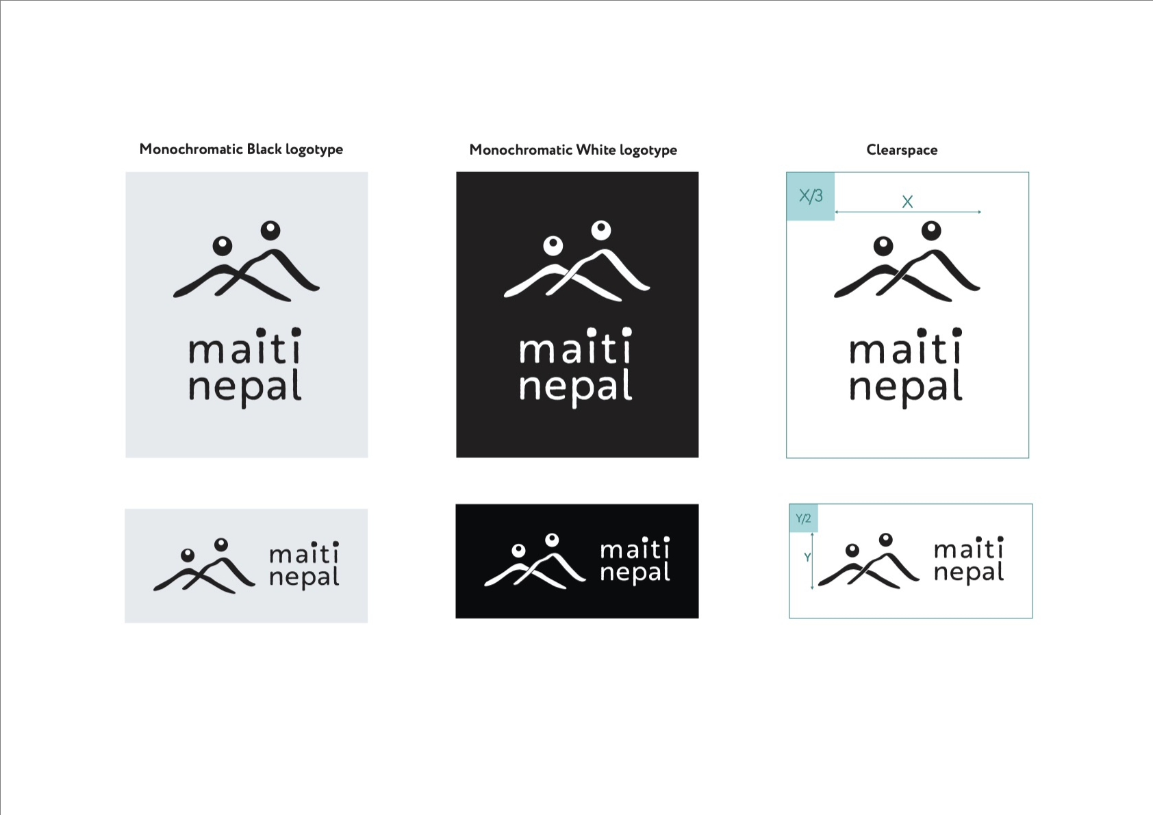
Built to hold up as a working brand, not just a single logo.
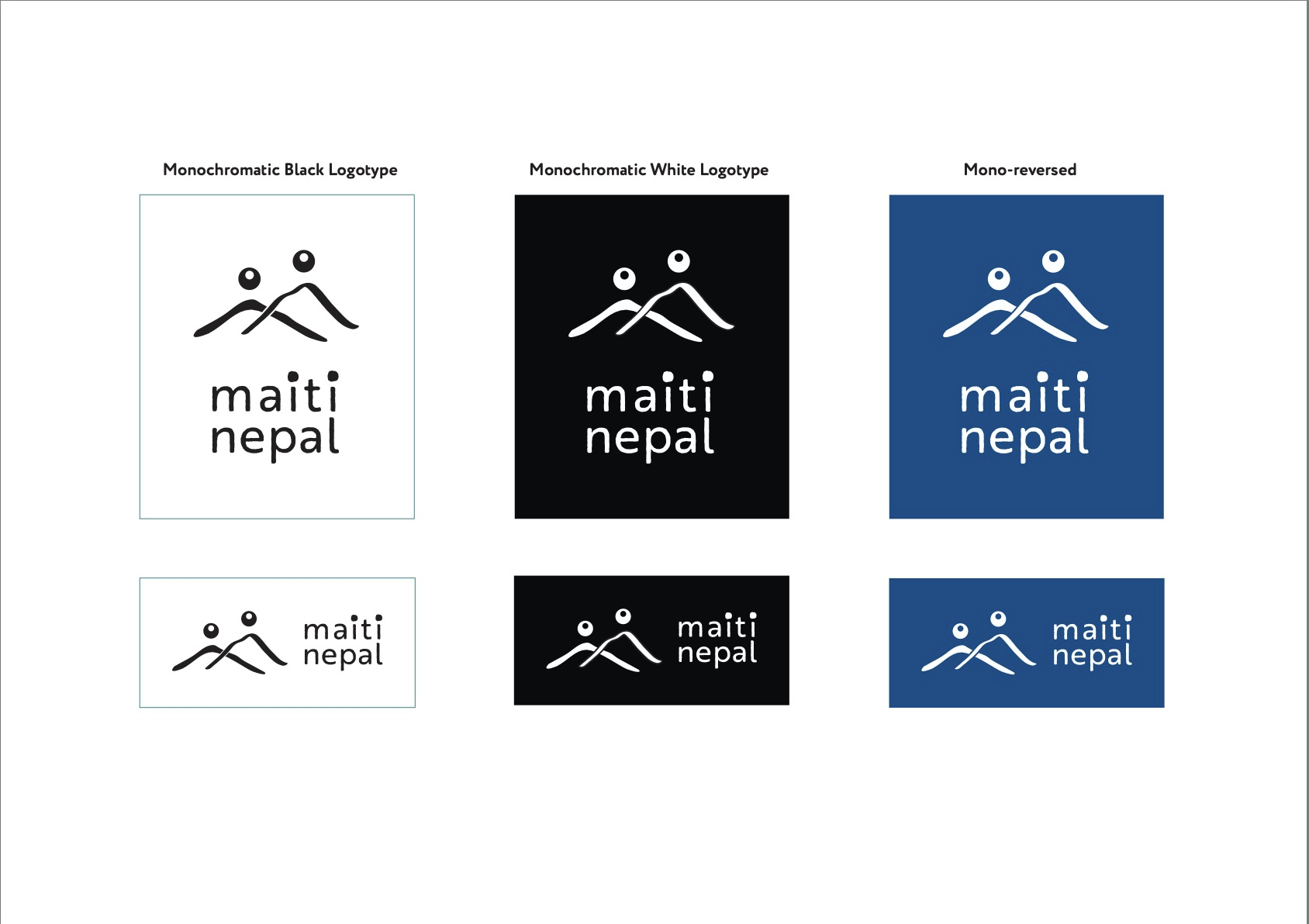
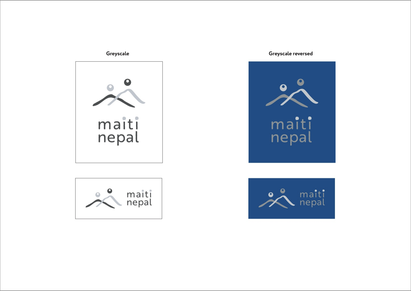
The concept is documented as a full identity system: primary and vertical logotypes; monochrome, greyscale, and reversed variations; and defined clearspace and minimum sizes for print and screen. Clear incorrect-usage rules protect the meaning, the dots and people-brushstrokes are never used in isolation, and the colours are never altered. Typography pairs Brother 1816 Printed for the logotype with Circe Rounded for headings and body, approachable and humane, suited to the organisation’s care-centred work.
The identity, tested out in the world.
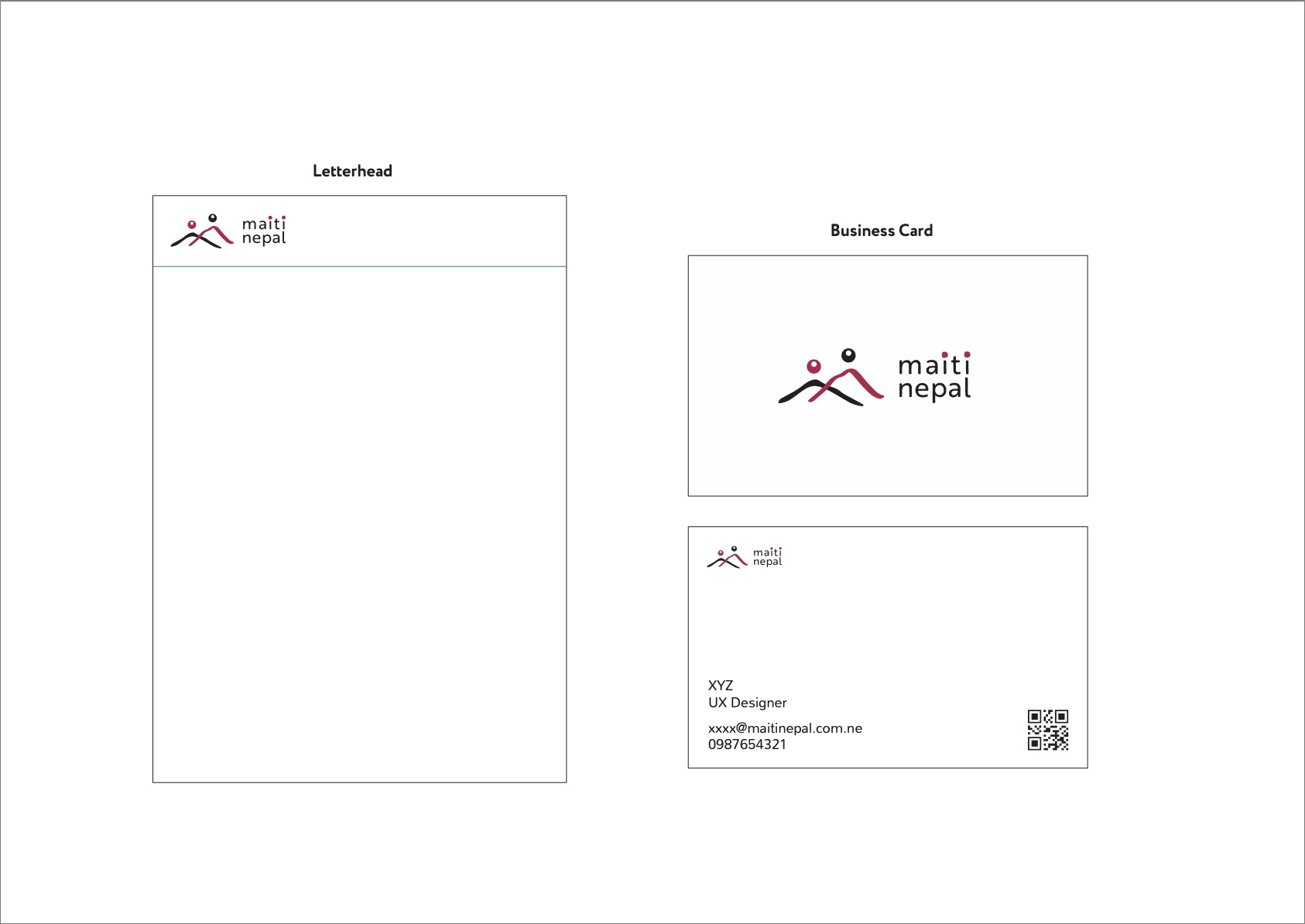
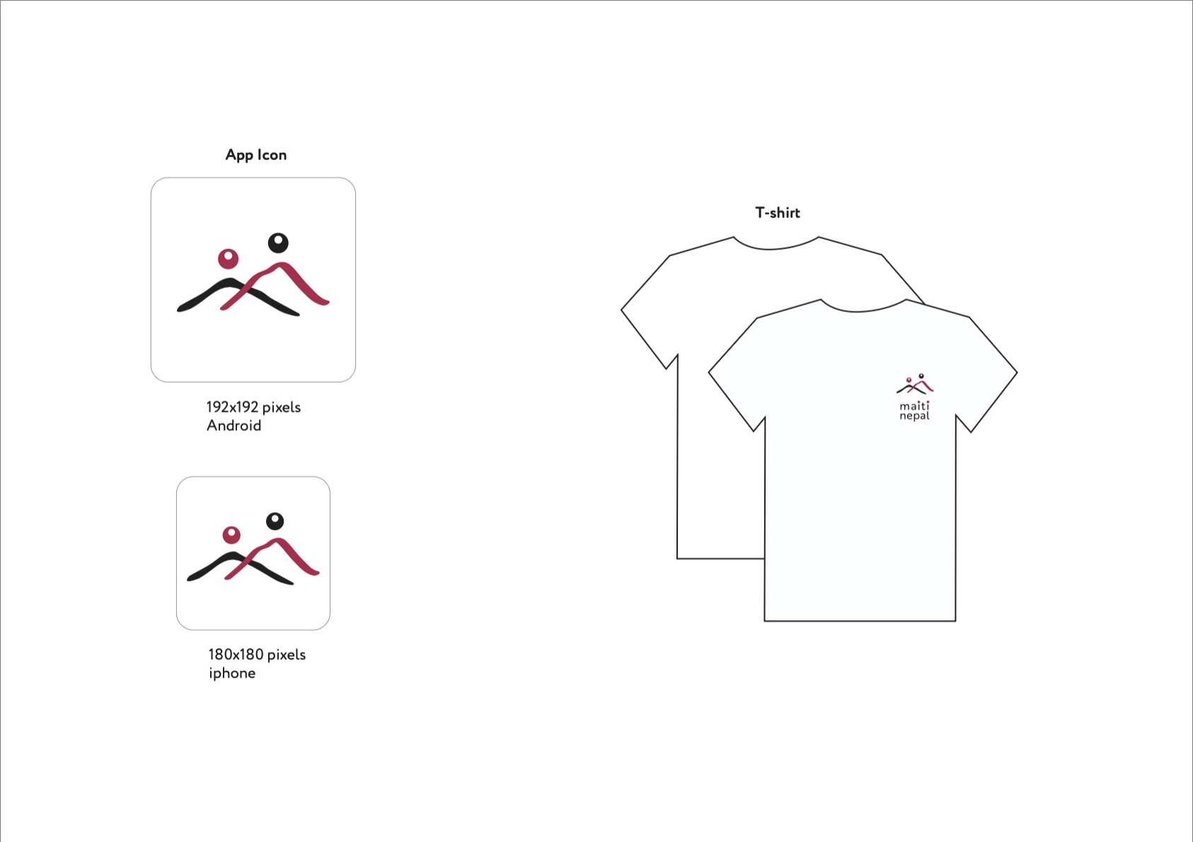
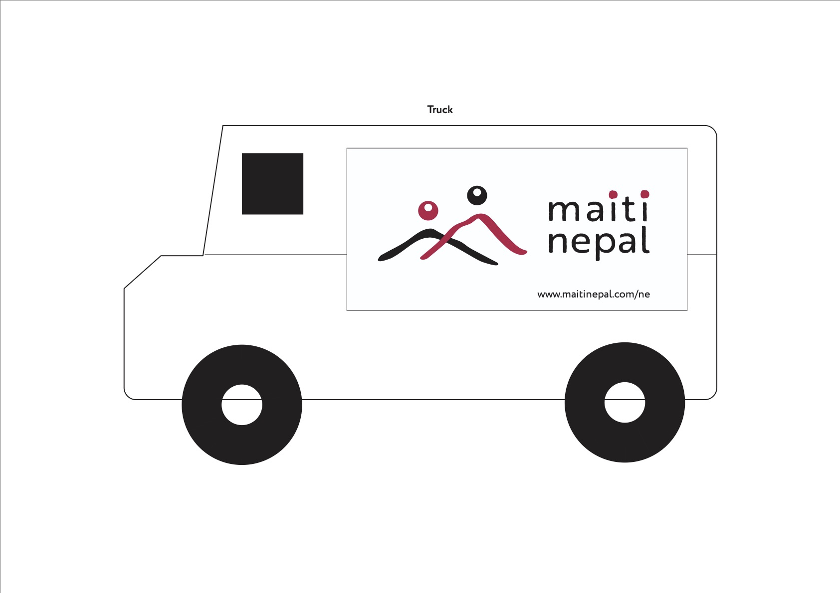
To test the system in use, I applied it across the everyday touchpoints an NGO relies on: letterhead and business cards, an app icon, apparel, and vehicle signage. Seeing the mark hold at a tiny app-icon scale and a large vehicle scale confirmed it keeps its meaning and legibility across contexts.
The real challenge was designing meaning, not just a mark.
The hardest and most rewarding part was making every element carry weight: a shape that is at once a mountain, a mother, and a child; a dot that is also a tika; a palette drawn from cultural dress rather than trend. Designing for an organisation that supports survivors also meant holding restraint as a discipline, the identity needed to feel safe, dignified, and human, never sensational. It taught me that in branding, cultural specificity and emotional care aren’t decoration, they’re the substance of a mark that means something. The same instinct, letting meaning and constraint drive every decision, is how I approach systems in product work too.